

A customer in Cape Coral is ready to book a service at 8:30 p.m. Another shopper in Fort Myers Beach wants to order a local gift online and grab it the same day. A boutique in Naples wants more than tourist walk-ins, but also needs a site the owner can manage during season.
Strong ecommerce website examples help solve those problems. The value is not in copying a national brand page for page. It comes from spotting the parts that reduce friction, speed up decisions, and match how local customers prefer to buy.
For Southwest Florida businesses, that usually means balancing convenience with limited time, staff, and budget. A Fort Myers retailer may need local pickup and simple promotions. An Estero service business may need online scheduling, clearer productized offers, and fewer drop-offs in the checkout or quote request flow. If your site is getting traffic but not enough sales or leads, these website conversion rate improvements are often a better starting point than a full redesign.
Ecommerce is no longer a side channel. Customers expect to browse, compare, order, book, and get answers without waiting for business hours. That shift creates pressure, but it also creates an opening for smaller companies. You do not need enterprise software to build a buying experience that feels clear, fast, and trustworthy.
The examples in this article focus on what to borrow, what to skip, and how to adapt big-brand strategy to a smaller Southwest Florida operation.
1. Sephora: Master the Loyalty Program
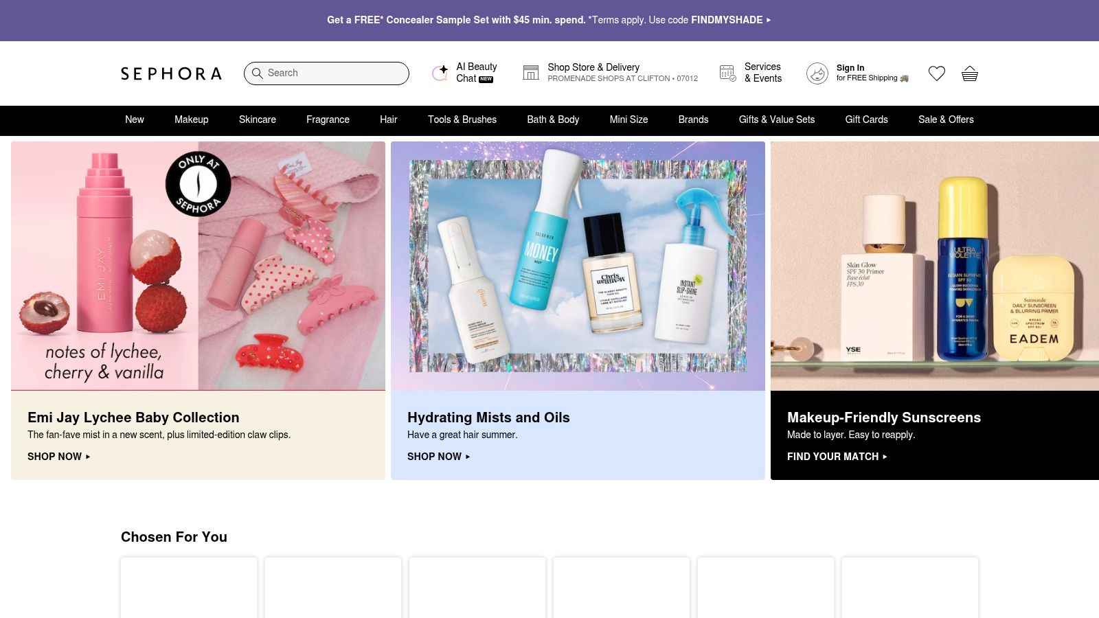
Sephora is one of the better ecommerce website examples for repeat purchase strategy. The site doesn’t rely on product pages alone. It gives shoppers a reason to come back through Beauty Insider, tiered benefits, and clear pickup options that connect online browsing to local fulfillment.
That’s useful in Southwest Florida because many SMBs need more repeat business, not just more traffic. A med spa in Naples, a gift shop in Sanibel, or a specialty food retailer in Bonita Springs can all borrow this logic. Give customers a clear reason to create an account, return, and buy again.
What Sephora gets right
Sephora makes the loyalty program visible without making it confusing at first glance. Customers can understand that membership leads to rewards, special perks, and better value over time. The details exist for people who want them, but the core pitch stays simple.
Its buy online, pick up in store flow also deserves attention. Local fulfillment works best when the website explains exactly what happens next, where to go, and what the customer should expect.
- Use simple tier language: If you offer bronze, silver, and gold levels, explain what changes at each step in plain English.
- Show rewards early: Don’t hide points, account credit, or member-only perks inside the account area.
- Make pickup obvious: Put pickup availability on product pages, cart pages, and confirmation emails.
Practical rule: If a customer has to hunt for loyalty rules or pickup details, they won’t trust the offer enough to use it.
For a smaller business, don’t copy the full Sephora system. Start with one repeat-purchase hook. That could be points, birthday perks, refill reminders, or early access to limited inventory. If your site isn’t converting existing traffic well, focus first on the basics of improving website conversion rates before layering on more rewards.
The trade-off is complexity. Tiered programs can feel impressive, but they also create customer questions. If your team can’t explain the benefit in one short sentence, the program probably needs to be simplified.
2. Chewy: Perfect the Subscription Model
Chewy does one thing especially well. It reduces the fear that usually stops people from subscribing.
That’s why its Autoship model works. Customers can schedule recurring deliveries, manage timing, skip shipments, or cancel without feeling trapped. For replenishment products, that matters more than flashy design.
A lot of local businesses can use this pattern. Think air filter replacements, pool chemicals, pet supplies, supplements, coffee subscriptions, cleaning products, or skincare refills. If people buy it repeatedly, subscription UX can turn occasional sales into steadier revenue.
What SMBs should copy
The strongest part of Chewy’s approach is transparency. The subscription isn’t presented like a commitment with hidden strings attached. It’s presented like a convenience tool the customer controls.
That changes buyer psychology. People are more likely to try a recurring order when they know they can pause it without calling support.
Here’s the practical version for a Southwest Florida business:
- Start with a replenishment item: Pick a product customers already reorder on a predictable cycle.
- Make controls visible: Put “skip,” “change date,” or “cancel anytime” language near the subscription offer.
- Build one management page: Customers shouldn’t need to email you just to adjust a shipment.
Chewy also keeps support paths easy to find, which is smart. Subscription programs create operational questions fast. If a customer can’t change an order on their own, your staff ends up doing admin work that wipes out the margin advantage.
The downside is discount pressure. Intro offers help first-time conversion, but if your margins are already thin, heavy subscription discounts can backfire. In practice, many small businesses are better off leading with convenience, priority access, or free local pickup rather than aggressive discounts.
Don’t launch subscriptions because the model sounds modern. Launch them only when the product naturally fits a repeat buying schedule.
3. REI: Build a Community with Membership
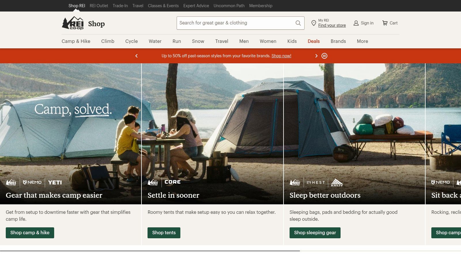
REI shows the difference between a discount program and a membership. A discount program says, “Buy now and save.” A membership says, “Join us because you belong here.”
That distinction matters. For some businesses, especially those with a strong niche or lifestyle angle, membership creates stickier loyalty than a standard coupon strategy ever will.
A Fort Myers paddle shop, Naples cycling business, or outdoor gear retailer can learn a lot from REI’s structure. The site supports the membership pitch with shipping information, store pickup details, and a brand identity that feels bigger than a transaction.
Where the model works best
REI’s strength is alignment. Membership, mission, and shopping experience all point in the same direction. The customer doesn’t feel like the business added a club just to collect fees.
For a smaller company, membership works when you can offer real ongoing value, such as:
- Access benefits: Early product drops, member-only booking windows, or reserved event spots
- Service perks: Free tune-ups, basic maintenance, priority support, or easier returns
- Community value: Workshops, local meetups, classes, or insider content tied to the niche
The other lesson is less glamorous but just as important. REI documents pickup and shipping clearly. That reduces support tickets and cuts confusion after checkout. If your business offers in-store pickup in Naples or curbside collection in Cape Coral, your website should answer operational questions before the customer asks them.
Baymard’s ecommerce design database is organized across 69 page types and includes examples dating back to 2012, which is a useful reminder that strong ecommerce website examples should be chosen by business model, not by homepage style. A membership-based outdoor retailer needs very different page patterns than a local service marketplace or a simple DTC product brand.
The risk with membership is overpromising. If customers pay to join and don’t feel clear value quickly, they won’t renew and they’ll be harder to win back.
4. B&H Photo Video: Integrate Content and Commerce
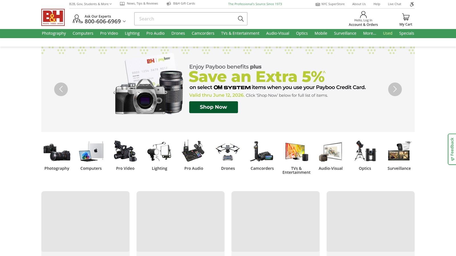
B&H Photo Video is one of the best ecommerce website examples for businesses that sell products people need help understanding before they buy. Cameras, electronics, lighting, and audio gear often require comparison, education, and trust before someone adds anything to cart.
That’s why B&H’s buying guides and eXplora content work so well. The educational content supports the purchase instead of living off to the side like a disconnected blog.
Why this model is so effective
Many small businesses separate content and commerce too much. They write articles that never link naturally to product categories, or they create product pages with no educational support at all. B&H closes that gap.
This is especially useful for Southwest Florida companies selling technical, regulated, premium, or multi-option products. Think marine electronics, medical supplies, specialty kitchen equipment, golf tech, security systems, or pro-grade tools.
A practical version looks like this:
- Build buyer guides around real questions: “Which pool robot fits saltwater pools?” works better than generic thought leadership.
- Link guides to products directly: Every educational page should move readers toward a category, product line, or consultation request.
- Use content to lower return risk: Clear comparisons help buyers choose the right item before checkout.
Adobe’s example of FoodServiceDirect.com managing a 250,000-SKU catalog with headless commerce is a strong reminder that content structure and product architecture become critical as catalogs grow. Most local businesses won’t need a setup that advanced, but the principle still applies. As product counts increase, your navigation, filtering, and category content need to stay organized or the site becomes expensive clutter.
If you want to apply this model, a good first step is tightening your ecommerce SEO best practices so category pages, product pages, and internal links support each other.
Educational content should answer the exact question that blocks the sale.
The trade-off is workload. Content-commerce systems work, but only if someone maintains them. A stale guide from two years ago can hurt trust faster than no guide at all.
5. Sweetwater: Add a Human Touch with Service
Sweetwater proves that ecommerce doesn’t have to feel cold. Its consultative sales model gives buyers a clear path to human help, which is exactly what many businesses forget when they move online.
That matters most with expensive, technical, or high-anxiety purchases. Customers don’t always want “self-service.” Sometimes they want one competent person who can answer the question and stay with the account.
Sweetwater’s named Sales Engineer approach is a smart pattern for businesses selling complex products or services. In local markets, this can work for HVAC equipment, medical devices, custom furniture, premium appliances, commercial cleaning packages, or business IT purchases.
How to apply the Sweetwater approach locally
You don’t need a giant sales team to create this experience. You need ownership.
Assign leads and customers to one point of contact whenever possible. Put that person’s name, phone number, or scheduling link where customers can find it. Add support language to product and checkout pages so buyers know help is available before they abandon the cart.
A simple setup can include:
- Named support: “Talk to Maria about fit, sizing, or setup” is stronger than a generic contact form.
- Post-purchase reassurance: Warranty messaging, setup help, or onboarding support should appear before checkout, not only after payment.
- Policy clarity: Returns, shipping exceptions, and service limitations should be easy to scan.
This model also helps service businesses that aren’t pure ecommerce stores. A roofing company, law firm, or healthcare practice can use the same idea by combining online request forms with a dedicated coordinator or estimator. The website does the intake. A real person closes the trust gap.
The downside is staffing. If you promise personal support and your team can’t answer quickly, the promise turns into frustration. Human-centered ecommerce works best when response workflows are realistic and documented.
6. Nike: Drive Engagement with Customization
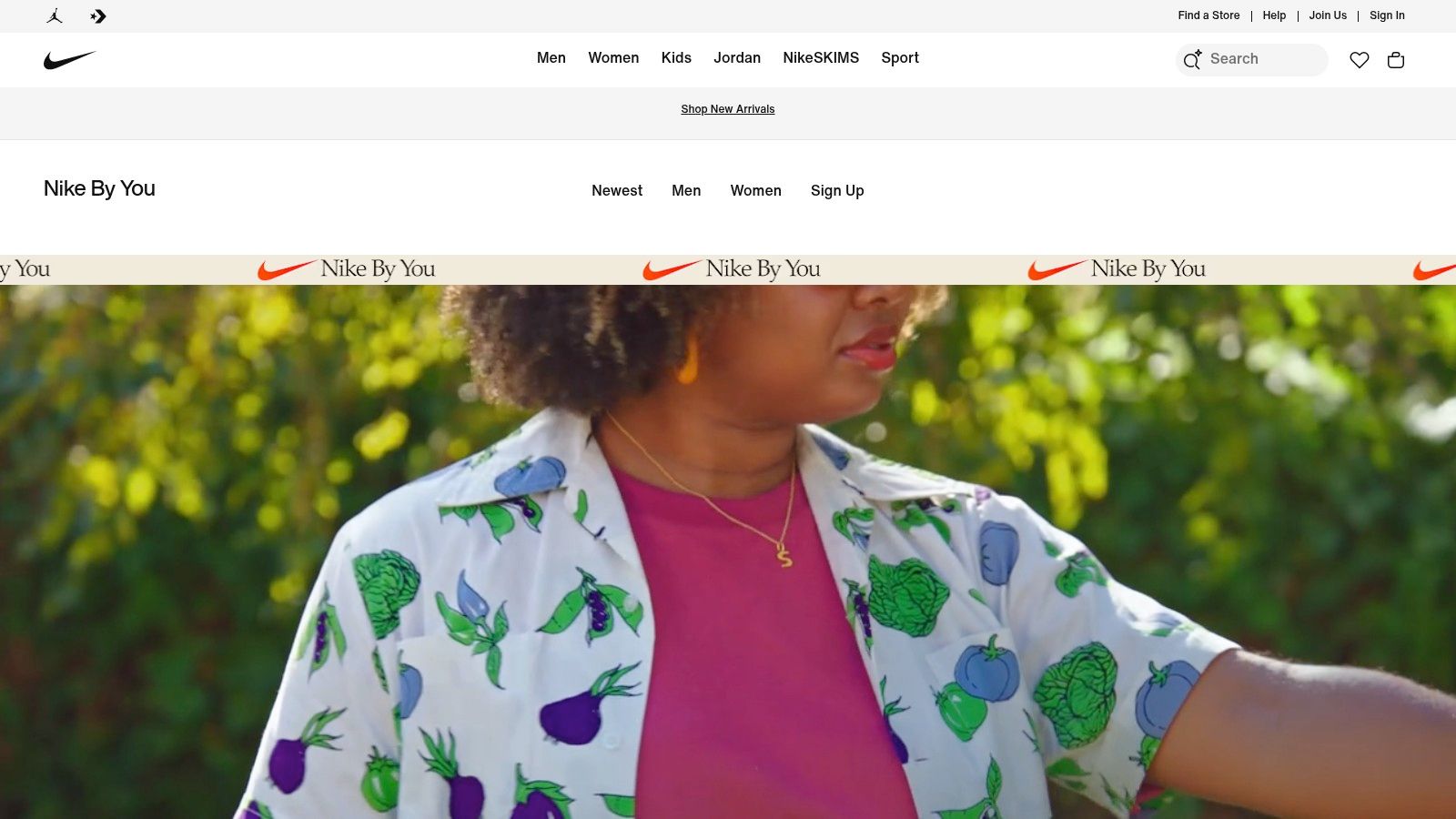
Nike By You is a strong example of turning shopping into participation. Instead of asking customers to choose only from fixed inventory, Nike lets them shape the product. That increases engagement and makes pure price comparison harder.
For smaller businesses, customization can be much simpler and still work. You don’t need a full shoe builder. You might let customers choose material, color, monogramming, bundle components, service package options, scent, finish, or gift presentation.
Where customization makes sense
Customization works best when it adds meaning without creating operational chaos. If every order becomes a special project your team has to manually decode, the website hasn’t solved anything.
Good fits include local gift stores, apparel brands, promotional product sellers, furniture makers, event businesses, and any company offering personalized packages. A Naples boutique could let shoppers build resort gift sets. A Fort Myers print shop could streamline branded merch kits. A catering company could let customers assemble event add-ons before requesting a quote.
HubSpot’s roundup cited by Elementor highlights examples like Moo and Farm Rio with country, language, or currency switching, and Dolce & Gabbana with accessibility controls, which supports a practical point that the best ecommerce website examples in 2026 often reduce friction through localization and accessibility, not visual flair alone (Elementor’s design roundup). For businesses serving tourists, seasonal residents, or international buyers in Southwest Florida, these details matter.
A better test: If customization helps the customer choose faster or feel ownership, keep it. If it only creates more internal handling, simplify it.
Nike’s member framing is also worth noting. Customization creates a natural reason to save preferences, store designs, and bring customers back later. The trade-off is lead time. Custom orders usually take longer, and your website needs to set expectations clearly before payment.
7. Apple: Streamline High-Value Purchases
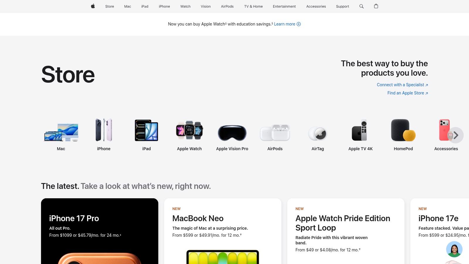
A customer is ready to spend $2,000, then pauses because the website makes one basic question hard to answer: what happens after I click buy? Apple avoids that stall. Its store walks buyers through product selection, configuration, trade-in, financing, pickup, and support in an order that feels clear.
That structure matters more than the visual design.
Apple sells expensive products by reducing uncertainty at each step. The buyer can compare options, see the monthly payment path, understand delivery or pickup choices, and know what support looks like after the sale. For high-ticket ecommerce, that is what raises conversion.
Small and mid-sized businesses in Southwest Florida can apply the same principle without copying Apple’s budget or tech stack. A Fort Myers office furniture dealer, a Naples jewelry store, or a Bonita Springs mobility equipment company can build a purchase flow that answers the actual hesitation points before a customer leaves the page.
A practical local setup often includes:
- Visible payment paths: Show financing, deposits, or split-payment options early, not at the last checkout screen.
- Trade-in or replacement credit: If customers are swapping old equipment or upgrading, explain the credit process in plain language.
- Fulfillment choices: Let buyers choose pickup, local delivery, installation, or consultation timing before payment is complete.
- Post-purchase clarity: Spell out warranty, service, setup help, or return rules where customers are making the decision.
As noted earlier, shoppers expect online buying to cover the same questions they would ask in store or over the phone. That is the key lesson from Apple. Your website should not just collect payment. It should remove doubt.
If your store handles considered purchases, review these best practices for ecommerce website design and check whether each step answers a specific buying question.
There is a trade-off. The more options you offer, the easier it is to create confusion, pricing mistakes, or checkout friction. I usually recommend starting with one clear version of each decision point. One financing explanation. One pickup policy. One trade-in process. For a small business in Southwest Florida, that discipline keeps the buying experience clear for customers and manageable for staff.
7-Point Ecommerce Strategy Comparison
A comparison table is useful only if it helps you choose what to build first.
For a Fort Myers retailer, Naples specialty shop, or Cape Coral service business, the right answer usually comes down to staff capacity, product type, and how often customers come back to buy again. These examples are worth studying because each brand solves a different conversion problem. The practical move is to borrow the model that fits your margin, team size, and customer behavior.
| Example | Implementation Complexity 🔄 | Resource Requirements ⚡ | Expected Outcomes 📊⭐ | Ideal Use Cases 💡 | Key Advantages ⭐ |
|---|---|---|---|---|---|
| Sephora: Master the Loyalty Program | Medium-high 🔄 Tiered rules + omnichannel pickup flows | Moderate-high ⚡ CRM, POS sync, content & support | Improved repeat purchases and CLV 📊⭐ | SMBs building repeat purchase programs and local pickup | Clear program value. Efficient BOPIS discoverability ⭐ |
| Chewy: Perfect the Subscription Model | Medium 🔄 Subscription UX + self-service controls | Moderate ⚡ Subscription platform + 24/7 support | Higher retention and predictable revenue 📊⭐ | Replenishment, refill products, and consumables | Transparent modify, skip, and cancel controls reduce churn ⭐ |
| REI: Build a Community with Membership | Medium 🔄 Paid membership setup + documented pickup flows | Moderate ⚡ Membership system, content, and store coordination | Stronger brand affinity and repeat buying 📊⭐ | Brands pursuing paid or co-op memberships and community | Mission-driven loyalty. Practical BOPIS docs reduce support ⭐ |
| B&H Photo Video: Integrate Content and Commerce | Medium 🔄 Content + PDP integration and SEO work | Moderate ⚡ Editorial resources, SEO, product linking | More qualified traffic. Fewer returns 📊⭐ | High-consideration categories needing education | Buying guides that pre-sell and improve conversion ⭐ |
| Sweetwater: Add a Human Touch with Service | Medium 🔄 Consultative sales model + warranty workflows | High ⚡ Trained sales staff (Sales Engineers) + service ops | Higher AOV, satisfaction, and lower return rates 📊⭐ | Complex or technical products needing expert guidance | Personalized consults and detailed post-purchase care ⭐ |
| Nike: Drive Engagement with Customization | High 🔄 Interactive builders and saved-design flows | High ⚡ Configurator dev, production flexibility + data capture | Increased engagement, perceived value, re-engagement 📊⭐ | Brands differentiating via product customization | Customization boosts value and first-party data capture ⭐ |
| Apple: Streamline High-Value Purchases | High 🔄 Integrated trade-in, financing, pickup, and config flows | High ⚡ Trade-in valuation, financing systems, store coordination | Smooth high-consideration conversions. Clearer total cost of ownership 📊⭐ | High-value configurable products and trade-ins | Smooth online-to-store handoff. Transparent trade-in process ⭐ |
The trade-off is simple. Higher-impact systems usually need more coordination across software, staff, and fulfillment.
That matters for Southwest Florida businesses with lean teams. A local pet supply store may get faster returns from subscriptions than from a custom product builder. A specialty outdoor retailer in Naples may benefit more from membership perks and events than from a complicated loyalty structure. A service-heavy electronics or musical instrument seller may gain more from consultative support than from chasing app-style personalization.
If budget is tight, start with the model that matches how your customers already buy. If buyers reorder on a schedule, test subscriptions. If they need education, invest in product content. If they have lots of questions before purchasing, put real human support into the buying process and make that support visible on the site.
Your Next Step: Building a Conversion-Ready Website
A Fort Myers retailer can have solid products, fair pricing, and a decent-looking site, then still lose sales because the buying path gets muddy on a phone. The issue usually is not design taste. It is friction. Slow pages, buried pickup details, weak category structure, or too many steps before checkout will cost real revenue.
The strongest ecommerce website examples solve those problems in plain view. They answer the customer’s next question fast and make the next action obvious. Depending on the business, that action might be a reorder, a booking, a quote request, a store pickup, or a financed purchase.
For Southwest Florida businesses, the practical move is to borrow the right pattern, not copy a national brand from top to bottom. A Naples salon may get more from loyalty and online gift card sales than from advanced product customization. A Cape Coral home service company may need scheduling, deposit collection, and service-area rules in checkout. A Fort Myers retailer may get quicker gains from local pickup, stronger collection pages, and a simple rewards program.
Analysts at Statista report that ecommerce now accounts for a 23.5% share of worldwide retail sales. Smartphone use also shapes how customers browse and buy. For a local business, that means product pages need to load fast, key policies need to appear early, and checkout actions need to stay visible on mobile.
Mobile performance can change results quickly. In one redesign case study, YETI reported a 63% year-over-year increase in mobile conversions after a mobile-first UX overhaul. A small business in Southwest Florida does not need YETI’s budget to apply the lesson. Start with simpler fixes. Cleaner navigation, fewer form fields, visible trust signals, and clearer calls to action usually do more than another homepage refresh.
Choose examples based on how your business sells. Subscriptions help repeat-purchase stores. Membership works for businesses with events, perks, or education. Service-driven sellers need visible human support. High-ticket products often need financing, trade-in logic, or a clearer explanation of total cost.
If your site looks fine but does not produce enough sales, bookings, or repeat customers, the next step is usually to rebuild the buying experience around customer behavior instead of making surface-level design changes. You can also review outside perspectives on how to build an online store with AI if you are comparing approaches before committing to a full build.