

A customer in Cape Coral taps your ad, lands on your site from an iPhone, and tries to buy before the next job starts or the kids get out of school. If the page pinches, loads slowly, hides the menu, or makes checkout feel like paperwork, that customer is gone. In Fort Myers, Naples, and the rest of Southwest Florida, that lost visit isn't abstract. It's a missed order, missed quote request, or missed appointment.
That's why the best practices for ecommerce website design need to be judged by one standard. Do they help people buy faster and trust you sooner? A site can look polished and still underperform if the structure is confusing, the mobile experience is clunky, or the calls to action are weak.
At Polaris Marketing Solutions, the practical test is simple. Can a local business owner get more leads, more sales, and fewer wasted clicks without turning the website into a bloated project? That usually means fixing fundamentals before chasing trendy features.
If you're already investing in traffic, your site has to carry its share of the load. If you want a broader view of optimizing ecommerce conversion rates, start there, then use the recommendations below to tighten the actual buying experience.
1. Mobile-First Responsive Design
A Fort Myers customer rarely gives your site a second chance on mobile. They tap from Google, Instagram, or an email, glance at the page for a few seconds, and decide whether buying from you feels easy or annoying. That decision happens on a phone first for many local businesses, especially restaurants, boutiques, service companies, and gift shops trying to catch people between errands, school pickup, and work.
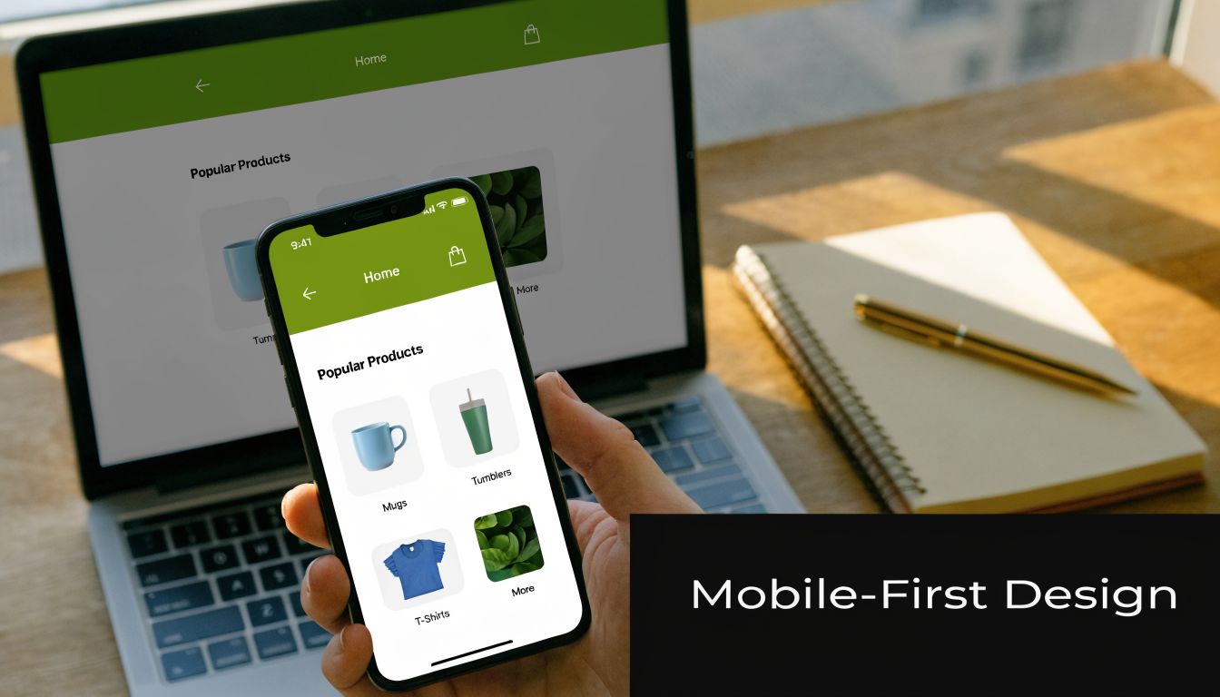
Mobile-first design means building the buying path for a small screen first, then expanding it for tablets and desktops. That sounds simple, but the trade-off is real. You have less room for oversized headers, crowded promo bars, extra menu items, and long blocks of copy. Small business owners often want to show everything at once. On mobile, that usually hurts conversion.
For a Fort Myers retailer, that means product grids need to be easy to scan with one thumb. For a Naples service business selling consultations or bookings, it means the call button, form, pricing summary, and scheduling options need to be visible without forcing people to hunt.
What mobile-first looks like in practice
Start with the actions that drive revenue. Can a visitor find the product, check the price, choose an option, and move to checkout without pinching the screen or correcting mistaps? Google's mobile-friendly guidance is still a useful baseline for responsive layouts, readable text, and touch-friendly design on smaller devices, as outlined in its mobile-friendly design recommendations.
A strong mobile-first setup usually includes:
- Large tap targets: Buttons, filters, and menu items need enough spacing to prevent accidental taps.
- Tight visual hierarchy: Product title, price, reviews, and add-to-cart button should appear in the order buyers need them.
- Mobile-specific actions: Click-to-call, tap-to-text, map directions, and short forms make sense for many Southwest Florida service businesses.
- Real-device testing: Test on current iPhones and Android devices over cellular data, not only inside a desktop browser.
One practical test works well. Have someone on your team place a test order or request a quote from the parking lot using their phone. If they get stuck, your customers are getting stuck too.
Local context matters here. A Cape Coral HVAC company may not need a huge product catalog, but it does need a mobile booking flow that gets a homeowner from problem to appointment fast. A boutique in downtown Fort Myers may need larger product images and fewer popups because shoppers are browsing while walking, waiting, or comparing stores. The right mobile design is the one that reduces friction for how your buyers behave.
For teams focused on retention as much as first-purchase conversion, this also connects to optimizing ecommerce CX for Shopify merchants.
2. Simplified and Intuitive Navigation
A Fort Myers customer lands on your site looking for one thing. A gift. A replacement part. A booking slot before the next storm rolls through. If the path is unclear, they do not study your menu. They leave.
Good navigation protects revenue because it shortens the distance between intent and action. For Southwest Florida businesses, that matters even more. Shoppers are often checking options from a phone in a parking lot, comparing prices during lunch, or trying to book fast before a competitor gets the sale.
Build your menu around buyer intent
Start with the words your customers already use. A roofing company should lead with “Roof Repair,” “Roof Replacement,” and “Storm Damage,” not internal labels that make sense only to the team. A boutique in downtown Fort Myers might need “New Arrivals,” “Dresses,” “Shoes,” and “Sale” because those are the paths that match how people shop.
The goal is simple. Help visitors answer two questions fast. What do you sell? Where do I click next?
Strong navigation usually includes:
- Clear category labels: Use plain language your customers recognize right away.
- A shallow site structure: Keep key pages close to the homepage so people do not dig through layers of menus.
- Consistent menu placement: The header, mobile menu, and category links should work the same way across the site.
- Search that is easy to find: High-intent shoppers often want to skip browsing and go straight to the product or service.
- Featured paths for top-margin offers: Put your best-selling or highest-converting categories where they are hard to miss.
For stores with a lot of products, filters matter almost as much as the main menu. Size, color, price, availability, and brand should narrow choices without creating clutter. If category pages are crowded with oversized thumbnails, tighten the layout and optimize images for the web so browsing stays clear and fast.
A local example
Say you run a cleaning company in Fort Myers with online booking. “Move-Out Cleaning” should not sit four layers deep under broad service pages. Put it in the primary navigation or make it one click from the homepage. That service often carries strong intent and faster close rates, so it deserves prominent placement.
I usually tell owners to review navigation by revenue, not by internal org chart. If a category drives calls, bookings, or average order value, feature it. If a menu item exists because it made sense during a website planning meeting but gets ignored by customers, cut it or move it lower.
Large retailers can afford complex menu systems because returning buyers already know the brand. A small business in Naples or Fort Myers usually wins with the opposite approach. Fewer choices. Clear labels. No dead ends.
3. Fast Page Load Speed and Performance Optimization
A shopper in Fort Myers taps your site from a parking lot, waits three seconds, and leaves before your product page finishes loading. That loss is easy to miss in analytics, but it shows up later in lower conversion rates, weaker ad performance, and fewer repeat visits.
Speed has a direct effect on revenue because it shapes the first impression before your copy, pricing, or offer has a chance to work. For small businesses in Southwest Florida, the usual problems are predictable. Oversized images. Bloated themes. Too many third-party apps. Low-cost hosting that struggles during traffic spikes. Video headers that look polished on office Wi-Fi and drag badly on mobile data in Fort Myers Beach, Estero, or Naples.
The biggest slowdowns often sit deeper in the site. Category pages load dozens of product thumbnails. Product pages pull in reviews, payment widgets, and tracking scripts. Checkout adds another layer of requests. A homepage can look fine while the pages that matter most to revenue are doing the damage.
I usually tell owners to start with the page types tied closest to money. Product pages. Collection pages. Cart. Checkout. If those pages are heavy, design improvements elsewhere will not save the sale.
A practical cleanup plan looks like this:
- Compress and resize images before upload: Large media files are one of the fastest ways to slow a store down. Use this guide on how to optimize images for the web to cut file weight without hurting quality.
- Audit apps and scripts: Every tool adds code, and plenty of stores are paying for features that reduce conversion more than they help it.
- Use hosting that can handle real traffic: If your server response is slow, every page on the site starts behind.
- Delay nonessential assets: Reviews widgets, chat tools, and heatmaps do not all need to load first.
- Keep media choices practical: If you need custom visuals but do not have a photo shoot budget yet, a realistic ai photo generator can help create lighter supporting assets than uploading huge raw files straight from a camera.
Fast sites also lower wasted ad spend. If you are paying for Google Ads, Facebook traffic, or seasonal email campaigns, every slow page makes each click more expensive. I see this often with local sellers who invest in promotion first and performance later. They buy traffic to a site that cannot carry the load.
Amazon built its advantage on buying efficiency, not decorative effects. Small businesses can apply the same lesson without copying Amazon's design. Strip out anything that slows the path to purchase and does not improve conversion. That trade-off usually produces better ROI than adding another animation, slider, or homepage feature.
If your site feels a little slow to you, it is slower for your customers. Test it on a phone, off Wi-Fi, the way a real shopper in Southwest Florida uses it.
4. High-Quality Product Images and Visual Hierarchy
A Fort Myers shopper lands on your product page from an Instagram ad while waiting in line for coffee. In a few seconds, they decide whether your product feels credible, worth the price, and easy to buy. Your visuals drive that decision before they read much of anything else.

Strong product imagery holds attention. Weak imagery creates doubt.
For physical products, that usually means more than one polished hero image. Show multiple angles, close-up detail, packaging, scale, and the product in use. If you sell coastal home goods in Naples, apparel in Fort Myers, or specialty gifts aimed at tourists and locals, good photography helps customers answer the questions they would normally solve in person. What does it feel like? How big is it? Does it look like the price?
Service businesses need the same clarity, just with different assets. Use real photos of your team, trucks, workspace, finished jobs, treatment rooms, or before-and-after results. A local roofer, med spa, or marine service company gets more value from authentic project photos than generic stock images that look like every other site in Florida.
Visual hierarchy matters just as much as image quality because attention needs direction. If the page is visually flat, shoppers work harder than they should. That usually costs conversions. For a practical breakdown of page structure and buyer behavior, Polaris shares useful guidance on how to improve website conversion rates.
Set up product pages so the eye lands in the right order:
- Lead with the primary product or service image
- Keep the product name, price, and key value points close to that image
- Make the main CTA the most visually obvious action on the page
- Use spacing and contrast to separate choices, instead of crowding everything together
Here's a quick visual reference worth watching before you redesign product pages:
AI visuals can help at the right stage. A realistic ai photo generator is useful for concept mockups, placeholder creatives, or testing page layouts before a full shoot. It should not stand in for the actual product, the actual staff, or the actual finished work on pages where trust drives the sale.
That trade-off matters. Small businesses in Southwest Florida do not need luxury brand photo budgets, but they do need honest, clear visuals that reduce hesitation and support the sale. If a customer cannot tell what you sell, why it costs what it costs, or what to click next, the page is underperforming.
5. Streamlined Checkout Process
A lot of ecommerce sites do the hard part well. They attract interest, explain the offer, and get someone to the cart. Then checkout ruins the sale.
The best checkout experience feels uneventful. No surprises. No required account before purchase. No wandering through unnecessary fields. No hunting for payment options.
Remove friction before you redesign anything else
If a customer is already ready to buy, your job is to stop slowing them down. That usually means simplifying form fields, showing totals early, and making the next step obvious on mobile and desktop.
The fastest improvements often come from these moves:
- Offer guest checkout: Don't force account creation before purchase.
- Show costs early: Shipping and fees shouldn't appear as a last-minute shock.
- Support common payments: Credit cards, digital wallets, and platform-native methods matter.
- Use clear progress indicators: If checkout has steps, show them.
For broader conversion work, Polaris has a practical breakdown of how to improve website conversion rates.
If checkout asks for information that doesn't help fulfill the order, question why it's there.
Product businesses and service businesses need different flows
A Shopify product store may need a short path from cart to payment. A Fort Myers contractor selling consultations or estimate requests needs a different version of efficient checkout. Instead of a cart, the friction point is usually the lead form.
That form should still follow the same principle. Ask only what helps qualify and route the lead. Name, contact info, service type, ZIP code, and a short project note often beat long intake forms that ask for every detail upfront.
Amazon trained buyers to expect speed. Small businesses don't need to mimic every feature. They do need to remove every avoidable obstacle.
6. Trust Signals and Social Proof
People won't buy from a site they don't trust. That applies whether you sell supplements, custom gifts, legal consultations, or AC service plans.
Trust signals do two jobs. They reduce fear, and they confirm that other buyers have already taken the risk. For smaller businesses in Fort Myers and Naples, this matters even more because you often don't have the built-in brand recognition of Amazon, Target, or Apple.
Put proof near decision points
Don't hide reviews on a separate page and assume people will go find them. Put social proof where hesitation appears. That usually means product pages, service pages, cart pages, and quote forms.
Use signals that feel concrete:
- Customer reviews: Especially specific reviews that mention the product, service, or outcome
- Security indicators: SSL, secure checkout messaging, and recognizable payment icons
- Return or satisfaction policies: Clear and visible
- Local credibility markers: Licenses, certifications, service areas, and real team photos
For a local business, Google reviews often carry more weight than generic testimonial sliders. If you're a Naples med spa, a Fort Myers roofer, or a Cape Coral cleaning company, showing recent local feedback can lower skepticism fast.
What doesn't work
Generic “We care about quality” copy doesn't build trust. Neither do anonymous testimonials with no names, no dates, and no context. Buyers have seen too many fake-looking review blocks.
A stronger approach is simple. Add a real customer comment to a relevant page. Pair it with an actual first name, last initial if needed, and enough detail to make it believable. If you've earned certifications or local recognition, place them near the form or CTA where reassurance matters most.
Buyers trust specifics. Vague praise rarely moves them.
7. Clear and Transparent Pricing and Policies
A Fort Myers shopper adds a beach gift basket to the cart, gets to checkout, and only then sees a delivery fee that changes the total. Many leave right there. The same thing happens when a Naples service company asks for a quote request but never explains starting price, travel fees, or turnaround time.
Hidden costs and vague policies create friction fast. For a small business, that friction shows up as abandoned carts, more pre-sale calls, and refund disputes that eat into margin.
Clear pricing removes guesswork. Clear policies remove hesitation.
If you sell products, put the full price in plain view and show any shipping costs or delivery rules before the final checkout step. If you sell services, explain what is included, what changes the final price, and whether the next step is a fixed purchase, a deposit, or a custom estimate. Buyers do not need every legal detail upfront. They do need enough information to decide whether to continue.
A strong setup usually includes:
- Return and refund terms linked from product pages and the cart
- Shipping costs and delivery timelines shown before payment
- Plain-English policy copy instead of dense legal wording
- Service area, trip fees, or minimums stated before someone fills out a form
- A short FAQ that answers common pre-purchase questions
That FAQ does more than reduce support tickets. It also improves the user experience signals search engines care about. Polaris Marketing Solutions explains that connection well in its guide on how user experience affects SEO.
Local context matters here. In Southwest Florida, weather delays, seasonal traffic, and service-area boundaries are part of the buying decision. If you run a Fort Myers ecommerce store, set delivery expectations around holidays and storm season. If you serve Cape Coral, Naples, and Estero, say exactly where you work and whether pricing changes by location.
Zappos is a useful example because its return messaging is easy to find and easy to understand. A small business does not need to offer the same policy. It does need to make the rules obvious before the customer pays.
Surprises hurt conversion. They also hurt profitability after the sale.
8. Search Engine Optimization Foundation
A well-designed ecommerce site that can't get found is still underperforming. SEO should be built into the site structure from the beginning, not patched in after launch.
This is especially important for small businesses in Southwest Florida because budget matters. If you can earn visibility for product searches, local service terms, and category pages, you reduce dependence on paid traffic and make every design improvement work harder.
Design and SEO are tied together
Site architecture, page hierarchy, internal links, image alt text, and page speed all affect discoverability. That means many of the best practices for ecommerce website design also improve search performance when implemented correctly.
For most businesses, the foundation looks like this:
- Category pages built around real search intent
- Unique product or service page copy
- Clean heading structure
- Internal links between related pages
- Location relevance where appropriate
Polaris explains the overlap well in this guide on how user experience affects SEO.
What local businesses often miss
A Fort Myers service company might build one generic “Services” page and expect it to rank for everything. That usually leaves money on the table. A stronger structure separates high-intent offerings into distinct pages with clear language and local relevance.
A product business can make the same mistake by relying on manufacturer copy, weak category text, or messy URL structures. Etsy succeeds in part because listings are structured around searchable terms and user intent. Smaller stores can apply the same principle at a simpler scale.
Good SEO isn't stuffing keywords into buttons and footers. It's building a site that clearly explains what you sell, where you sell it, and why each page deserves to exist.
9. Customer Reviews and Ratings System
A testimonial page is helpful. A working review system is better.
When customers can rate products or leave feedback directly on the relevant page, you create two advantages at once. New buyers get reassurance, and your business gets insight into where the offer, fulfillment, or messaging needs work.
Make reviews easy to use, not just easy to collect
A good review system lets visitors scan quickly. They should be able to spot recent feedback, read detailed comments, and understand whether the reviewer bought the item or used the service.
The most useful setup includes:
- Simple submission forms: Don't make customers write an essay
- Visible review sorting: Recent, helpful, highest-rated, lowest-rated
- Photo support where useful: Especially for physical products
- Response functionality: So your team can address problems publicly and professionally
Amazon set the standard for making reviews part of the buying decision. Target, Walmart, and Etsy all reinforce that same expectation. Small businesses benefit from adopting the principle, even if the implementation is simpler.
Service-based businesses can use this too
This matters beyond product catalogs. If you're a Fort Myers attorney, med spa, or home services company using ecommerce-style lead generation, ratings and reviews can support conversion on booking and inquiry pages too.
Use reviews that match the page intent. On a page for roof repair, show feedback about responsiveness and repair quality. On a page for online ordering, show comments about fulfillment and communication. Relevance makes reviews persuasive.
What works least well is a wall of generic praise with no structure. Let buyers filter, skim, and verify.
10. Effective Call-to-Action Design and Placement
If the next step isn't obvious, some visitors won't take one. CTA design sounds simple, but it's where many ecommerce sites get vague.
Buttons like “Learn More” or “Submit” often underperform because they don't answer the buyer's real question. What happens when I click this? If the page has done its job, the CTA should finish the thought.
Match the CTA to buying intent
A product page should usually lead with “Add to Cart” or “Buy Now.” A service page might need “Get a Quote,” “Book Online,” or “Schedule Consultation.” The wording matters because it frames effort, expectation, and urgency.
Place primary CTAs where people are ready to act:
- Near price and product information
- High on mobile screens
- Repeated on long pages
- Close to trust signals
A Fort Myers pool service site shouldn't make users scroll past a giant brand story just to find the estimate button. A Naples boutique shouldn't bury add-to-cart under oversized lifestyle imagery.
Design for visibility, not decoration
Your primary CTA should stand out from surrounding elements. That usually means contrast, size, whitespace, and plain language working together. It doesn't mean making every button bright and loud.
The strongest CTA on the page should point to the one action that matters most.
Amazon's “Add to Cart” works because it's visible and expected. Mailchimp and Dropbox do the same in lead-generation contexts by making the next step obvious, not clever. Local businesses should do likewise. If you want the visitor to request an estimate, say that. If you want the sale, ask for it directly.
Weak CTAs create hesitation. Strong CTAs remove it.
Ecommerce Design: Top 10 Best Practices Comparison
| Feature | Implementation Complexity 🔄 | Resource Requirements ⚡ | Expected Outcomes 📊 | Ideal Use Cases 💡 | Key Advantages ⭐ |
|---|---|---|---|---|---|
| Mobile-First Responsive Design | Medium–High, responsive CSS and device testing required | Moderate, front-end devs, device testing, optimization tools | Higher mobile conversions, lower bounce, better SEO | Mobile-heavy audiences, local businesses with on-the-go customers | Improves UX and SEO; future-proofs site |
| Simplified and Intuitive Navigation | Low–Medium, information architecture and user testing | Low, UX designer, basic testing | Better product discovery, longer sessions, reduced confusion | Catalogs, service sites, small business websites | Faster findability; fewer support requests |
| Fast Page Load Speed & Performance | High, technical optimizations and monitoring | High, devs, CDN, hosting upgrades, tooling | Lower bounce, improved rankings, higher conversions | High-traffic stores, mobile users on slow networks | Faster UX; reduced hosting/resource costs |
| High-Quality Product Images & Visual Hierarchy | Medium, photography workflow and layout design | High, pro photography, editing, storage/bandwidth | Increased trust, higher AOV, fewer returns | Product-heavy catalogs, high-value items, service before/after | Stronger perceived value; better marketing assets |
| Streamlined Checkout Process | Medium, payment integrations and UX flow design | Moderate, payment gateways, devs, QA | Lower cart abandonment; increased completed purchases | Ecommerce merchants, sites with high checkout friction | Direct revenue lift; better mobile checkout performance |
| Trust Signals & Social Proof | Low–Medium, integration and moderation processes | Low–Medium, review platforms, monitoring resources | Increased trust and conversions; better SEO from UGC | New/local businesses building credibility | Builds credibility quickly; persuasive social proof |
| Clear & Transparent Pricing and Policies | Low, content and page placement, legal review | Low, copywriting and occasional legal input | Fewer disputes, reduced cart abandonment, higher satisfaction | Services with variable fees; subscription models | Reduces buyer remorse; lowers support load |
| SEO Foundation | High, technical SEO, content strategy, ongoing work | Medium–High, specialists, content creators, tools | Sustainable organic traffic; long-term visibility (3–6+ months) | Small budgets competing with larger brands; local search | Cost-effective long-term traffic and authority |
| Customer Reviews & Ratings System | Medium, review system, moderation, verification | Moderate, platform/integration, moderation team | Large conversion uplift; fresh UGC for SEO | Marketplaces, product sellers, local service providers | Authentic feedback loop; boosts trust and SEO |
| Effective CTA Design & Placement | Low, design and iterative A/B testing | Low, designers, testing tools | Clearer user actions; measurable conversion increases | Landing pages, product pages, service booking flows | Guides user behavior; quick uplift with testing |
Turning Best Practices into Business Growth
The biggest mistake small businesses make with ecommerce design is trying to fix everything at once. That usually leads to a long wish list, a bloated project, and very little measurable progress. A better approach is to work in order of impact.
Start with the issues that directly affect whether people can use the site at all. Mobile experience comes first. Speed comes right behind it. If your pages are hard to use on a phone or too slow to load, every dollar you spend on ads, SEO, social media, or email gets less efficient. Those are the quickest wins because they improve the experience for nearly every visitor.
After that, tighten navigation, checkout, and calls to action. Those are the parts of the site that turn passive browsing into action. If a shopper can't find the right category, trust the page, or understand what to click next, you won't get the conversion even if the design looks modern. Practical trade-offs matter in these areas. Most Fort Myers businesses don't need a flashy rebuild loaded with custom features. They need a cleaner path from landing page to sale, quote request, or booking.
For service-based businesses in Southwest Florida, that path often looks different from a traditional product store. A roofing company, law firm, med spa, or cleaning service usually needs lead capture, service-page clarity, local trust signals, and fast booking flows more than it needs advanced merchandising tools. That gap gets overlooked in a lot of generic ecommerce advice. The design still needs to sell online. It just does so through inquiries, consultations, and appointments rather than a standard cart.
If you're not sure where your site stands, audit it against this list and be honest. Open it on your phone. Try to find a product in a few taps. Try to request service like a first-time visitor. Try to check out without using your office Wi-Fi. The friction points show up fast when you test like a real customer.
Polaris Marketing Solutions is one option for businesses that want help translating these best practices into a practical roadmap. Because the agency works with small and mid-sized businesses in Fort Myers and surrounding Southwest Florida markets, the conversation can stay grounded in actual business goals, budget constraints, and local competition rather than generic advice.
If you want a clearer picture of what's helping or hurting your site, contact Polaris Marketing Solutions for a complimentary online analysis and competitor report. A focused plan beats another redesign guess every time.
If you're ready to improve mobile usability, tighten conversion paths, and build an ecommerce site that fits how customers in Fort Myers shop, reach out to Polaris Marketing Solutions.