

If you want to know the secret to a faster website—one that ranks higher and turns more visitors into customers—it starts with your images.
It really boils down to three simple steps for every single image you upload: you have to resize it, compress it, and choose the right file format. Get this trio right, and you're already ahead of most of your competition.
Why Slow Images Are Costing You Customers and Rankings
We’ve all been there: staring at a blank screen, waiting for a website to load. For your potential customers, that wait is often a dealbreaker. More often than not, the culprit behind a sluggish site is unoptimized images, and they’re doing direct harm to your bottom line and your search engine rankings.

When you upload a picture straight from a high-quality camera or smartphone, it’s bloated with data you don't need for the web. All that extra weight adds precious seconds to your load time, creating a poor user experience that Google absolutely notices.
This isn't just a minor inconvenience. Search engines track user experience with metrics called Core Web Vitals. One of the most important is Largest Contentful Paint (LCP), which measures how fast the biggest element on the page—usually your main hero image—appears for a visitor. A slow LCP tells Google your site is clunky, and that can sink you in search results.
The Real-World Cost of Slow Images
Picture this: you're a local service business here in Naples, FL. A potential customer finds you on their phone and clicks. They wait… and wait… while your huge, beautiful portfolio images slowly pixelate into view. They get frustrated, hit the back button, and click on your competitor’s site, which loaded in a flash. You just lost a solid lead.
This happens every single day. In fact, research shows 53% of mobile users will abandon a page if it takes more than three seconds to load. With the average website featuring around 59 images, those oversized files can easily inflate your load times by over 70%. You can dig deeper into how site speed impacts sales in our breakdown of user experience and SEO.
A faster website isn't just a "nice-to-have"—it's a powerful conversion tool. Data shows that websites delivering a fast experience can see conversion rates increase by 5.4% for every 10% of additional content a user views. That only happens when your pages load instantly.
Tying Optimization to Your Business Goals
Learning how to optimize images isn’t just a technical task for a web developer; it's a core business strategy that directly pays off.
- Better User Experience: Fast-loading pages keep visitors engaged and on your site longer.
- Higher Conversion Rates: A quick website means fewer abandoned shopping carts and more form submissions.
- Improved SEO Rankings: Faster LCP and Core Web Vitals scores are exactly what Google wants to see.
- Lower Bounce Rates: Visitors won't leave out of frustration before they even see what you offer.
By taking a few extra moments to properly size and compress your visuals, you're making a direct investment in your company's online visibility and profitability. This guide will give you the practical, no-nonsense steps to make it happen.
Choosing the Right Image Format
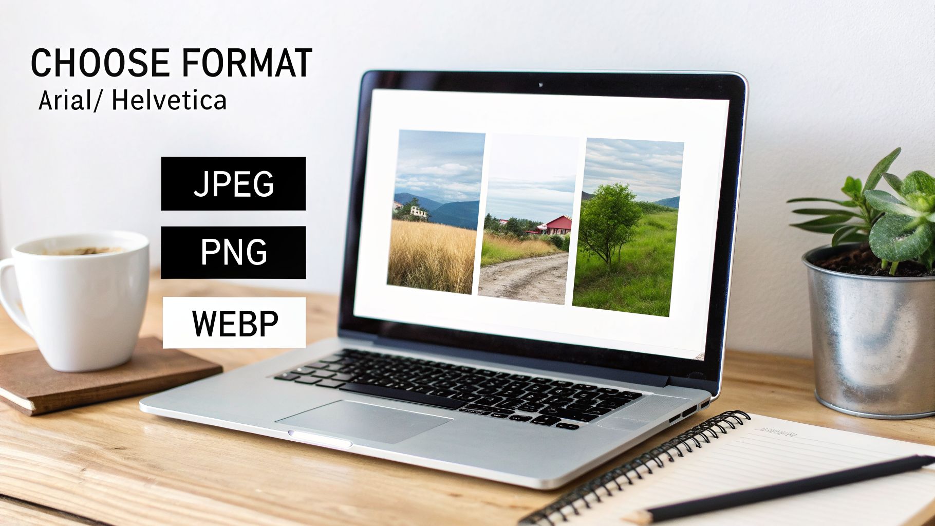
Before you even think about resizing or compressing, you have to pick the right image format. This is the very first—and one of the most critical—decisions in the whole optimization process. It's not about finding one "best" format; it's about choosing the right tool for the job.
Getting this wrong can either bloat your page with massive files or leave you with blurry, unprofessional visuals. Both outcomes are bad for business. A slow-loading image is just as damaging as a pixelated one. Let’s break down the three formats that will cover virtually every need you have: JPEG, PNG, and WebP.
JPEG: The Photographic Workhorse
For decades, JPEG (or JPG) has been the undisputed king of web photos, and for good reason. It’s built for complexity. In fact, as of early 2026, JPEGs are still used on a staggering 71.9% of all websites, a testament to their reliability. You can dig into the data yourself with W3Techs' technology report on image formats.
The magic behind JPEG is lossy compression. This sounds a little scary, but it just means the format intelligently removes tiny bits of data the human eye won't miss, drastically shrinking the file size.
- When to Use JPEG: It’s your go-to for any photographic content. Think product shots, team headshots, portfolio galleries, or the "before and after" pictures for your contracting business.
- Actionable Example: A Naples-based real estate agent should absolutely use JPEGs for their property listing photos. The format perfectly captures the rich colors of a Gulf Coast sunset and the sharp details of a newly renovated kitchen, all while keeping file sizes small enough for a fast-loading gallery.
Pro Tip: Don't be afraid to dial down the JPEG quality. We've found a quality setting between 70-80% is the sweet spot, slashing file size with almost no visible difference. One of our clients, a Cape Coral plumber, saw their site load time drop from 4.2 seconds to under 2 seconds just by doing this. That simple change boosted their conversions by 25% because Google rewarded their faster site with better local rankings.
PNG: For Graphics and Transparency
Unlike JPEG, PNG uses lossless compression, meaning it shrinks the file without discarding any data. This guarantees perfectly crisp lines and solid colors, which is fantastic for certain graphics. But that perfection comes at a cost—PNG files are almost always larger than JPEGs, especially for photos.
Where PNG really shines is its support for transparency. This feature is a non-negotiable for modern web design.
- When to Use PNG: It is the only choice for logos, icons, and any graphic that needs a transparent background to sit cleanly on your site.
- Actionable Example: Your company logo in the website header has to be a PNG. It allows the logo to float seamlessly over a colored navigation bar or a background image without that clunky white box around it. Another great use is for website screenshots in tutorials, where text needs to be perfectly sharp and readable.
WebP: The Modern High-Performer
Developed by Google, WebP is a next-generation format built specifically for the modern web. It truly offers the best of both worlds, with both lossy and lossless compression that blows older formats out of the water. On average, a WebP file can be 25-34% smaller than an equivalent JPEG or PNG without sacrificing quality.
It also supports transparency, making it a powerful contender to replace both JPEGs and PNGs in most situations.
- When to Use WebP: Use it for your most important visuals where quality and speed are non-negotiable. This is perfect for hero images on your homepage, key product photos, and the main images in your blog posts.
- Actionable Example: A restaurant in Fort Myers should use WebP for the main banner photo of their signature dish. The image will look incredible and appetizing, but it will load almost instantly, keeping hungry potential customers from clicking away. Most modern image tools, like Squoosh, allow you to save directly to WebP format.
Browser support for WebP is now nearly universal, but it's still smart to have a JPEG or PNG fallback just in case someone visits on an ancient browser. The good news is that most modern WordPress plugins and platforms like Shopify handle this for you automatically.
Image Format Comparison: JPEG vs. PNG vs. WebP
Feeling a little overwhelmed by the options? Don't be. Most of the time, the choice is pretty clear once you know what to look for.
Here’s a quick reference table to help you make the right call every time.
| Format | Best For | Key Feature | Pro Tip for Local Businesses |
|---|---|---|---|
| JPEG | Photographs, complex images with many colors | Excellent compression | Use for your portfolio, gallery, and "before & after" shots. Aim for 75% quality. |
| PNG | Logos, icons, simple graphics with solid color | Transparency support | Absolutely essential for your company logo to avoid a clunky white box around it. |
| WebP | All image types (the modern replacement) | Superior compression | The best choice for homepage hero images and key product photos for maximum speed and quality. |
Ultimately, choosing the right format is the foundation of a fast, professional-looking website. By using this table and the examples above, you can ensure every image on your site is working for you, not against you.
Mastering Your Image Compression and Resizing Workflow
You’ve picked the perfect image format. Now for the most critical part of the process: resizing and compressing. This is where the magic happens, where you'll watch those huge file sizes shrink without losing the crisp, professional quality your brand is known for.
Skipping this two-step dance is one of the biggest mistakes I see business owners make.
It's tempting to upload that massive 5000-pixel photo straight from your new iPhone, but it's a disaster for your website's speed. Your visitor's browser is forced to download a file that's way bigger than it needs to be, only to shrink it down to fit their screen. Think of it like sending a moving truck to deliver a single pizza—it’s slow, wasteful, and makes for a terrible customer experience.
Resize Your Images Before You Upload
Here’s the first rule of image optimization: always resize your images to the maximum size they’ll be displayed on your website before you upload them. Never rely on your website or a CMS like WordPress to do the heavy lifting of shrinking huge images. Do it first.
Every website is a little different, but here’s a simple recipe with common dimensions that works as a fantastic starting point for most business sites:
- Full-Width Hero or Banner Images: These are the big, eye-catching images at the top of your pages. A width of 1920 pixels is a solid, reliable standard.
- Blog Post or Interior Page Images: For pictures that sit inside your main content area, a width of 1200 pixels is usually plenty.
- Smaller Inline Images: For visuals tucked inside a column of text or in a gallery, somewhere between 600 and 800 pixels wide is the sweet spot.
By resizing first, you’re instantly dropping a huge amount of unnecessary data before you even think about compression.
Compress for Maximum Impact
Once your image is properly sized, it's time to compress it. This is where we intelligently strip out hidden data and make tiny quality adjustments that the human eye will never notice, shrinking the file size even more.
You don't need expensive software for this. Powerful and free online tools make it incredibly simple to get professional results.
Real-World Scenario: Imagine you're a contractor with a beautiful 2MB photo of a finished kitchen remodel for your portfolio. A potential client in Naples, viewing your site on their phone with a weak signal, might wait 5-10 seconds for that one image to load… and then just give up. After resizing it to 1200px wide and running it through a compression tool, that same image is now a lean 150KB. It loads almost instantly, keeping that lead engaged and impressed. This is how you close more deals.
Your Go-To Compression Tools and Settings
You don't need to be a graphic designer to get this right. Let's walk through two of the best free tools out there and the exact settings you should be using.
1. Squoosh (squoosh.app)
This is a fantastic browser-based tool from Google that gives you a live preview of your changes. Just upload your resized image, and you can use a slider to fine-tune the quality. For JPEGs and WebPs, dragging the "Quality" slider down to the 70-80% range is the sweet spot. You'll see the file size plummet on the right side of the screen with little to no visible drop in quality.
2. TinyPNG / TinyJPG (tinypng.com)
If you want pure simplicity, TinyPNG is your best friend. You just drag and drop your resized images (up to 20 at a time), and its algorithm does the work for you. It’s less about manual control and more about getting a fast, effective result without any guesswork.
These principles of file compression apply across all digital media. For instance, if you're also producing video content, you can master video compression for YouTube to make sure your videos load just as efficiently as your new, optimized images.
Making this resize-then-compress habit a core part of your workflow will drastically cut your page load times. This simple discipline has a direct, positive impact on user experience and can significantly reduce your website's bounce rate, keeping more potential customers right where you want them.
Alright, you've handled the basics of resizing and compressing. Now it's time to get into the advanced stuff—the techniques that really separate the fast, professional websites from the slow, amateur ones.
These aren't just minor tweaks. The two strategies we're about to cover, responsive images and lazy loading, are exactly what major online retailers and media sites use to deliver a lightning-fast experience. They might sound a bit technical, but the ideas behind them are simple and the impact is massive, especially for your mobile visitors.
Deliver Perfect Images with a Responsive Design
Imagine having a few different versions of your main homepage image: a huge one for big desktop monitors, a medium one for tablets, and a small, lightweight one for smartphones. That’s the entire concept behind responsive images.
Instead of making a tiny phone download a massive desktop-sized picture (and burn through data), the browser gets smart. It looks at the visitor's screen and serves up the most appropriate, perfectly-sized version.
We know that great visuals hit the brain 74% faster than text, but forcing a phone to load a giant, unoptimized image will absolutely demolish your conversion rates. By using a technique called srcset, the browser can choose the right fit for any device, often slashing data usage by 40-60%. This doesn't just save bandwidth; it gives your load time and Core Web Vitals a serious boost. For more data on this, check out these eye-opening web design statistics.
This is a complete game-changer for local businesses. We had one of our HVAC clients in Cape Coral implement responsive images, and it cut their total image weight by 45%. That one change directly improved their site's stability score and led to a 63% jump in demo requests, which we tracked and confirmed. Slow images are a conversion killer, and this is the cure.
How to Make Your Images Responsive
The good news? Most modern platforms like WordPress and Shopify will automatically create these responsive versions for you when you upload an image. Still, it's good to know what’s happening under the hood.
Here’s a simplified peek at the HTML code it generates:
srcset: This is just a list of all the different image sizes you have available, along with their actual widths (image-small.jpg 480w).sizes: This part tells the browser how much space the image will actually fill on the screen at different breakpoints.
You really don't need to write this by hand. Your job is to upload properly sized and compressed images, and a good system will build the rest for you.
Of course, before you even get to compression, your photos need to be prepped and polished. For any business owner selling products online, mastering ecommerce image editing is the first, non-negotiable step to make sure your product shots look incredible before they ever touch your website.
Boost Initial Page Speed with Lazy Loading
Lazy loading is another powerful strategy that's all about improving perceived performance. It’s a simple trick: it tells the browser not to load any images that are "below the fold"—that is, any images a user can't see until they start scrolling.
Think of it like a restaurant only bringing out your main course after you've finished your appetizer. The whole experience feels quicker because the browser isn't wasting time and bandwidth loading things the user might never even scroll down to see.
This is now built directly into modern browsers, so turning it on is unbelievably easy. You just add the loading="lazy" attribute to your image tags.
For example, your code would look like this:<img src="your-image.jpg" loading="lazy" alt="An image that will only load when scrolled into view.">
That one little addition tells the browser to wait until the image is about to scroll into view before it bothers to download it. For image-heavy pages like a long blog post or a big project gallery, this can easily shave seconds off the initial load time. Most modern website platforms and plugins will even apply this for you automatically.
To put it all together, the workflow is simple. First you resize, then you compress, and finally, you upload.
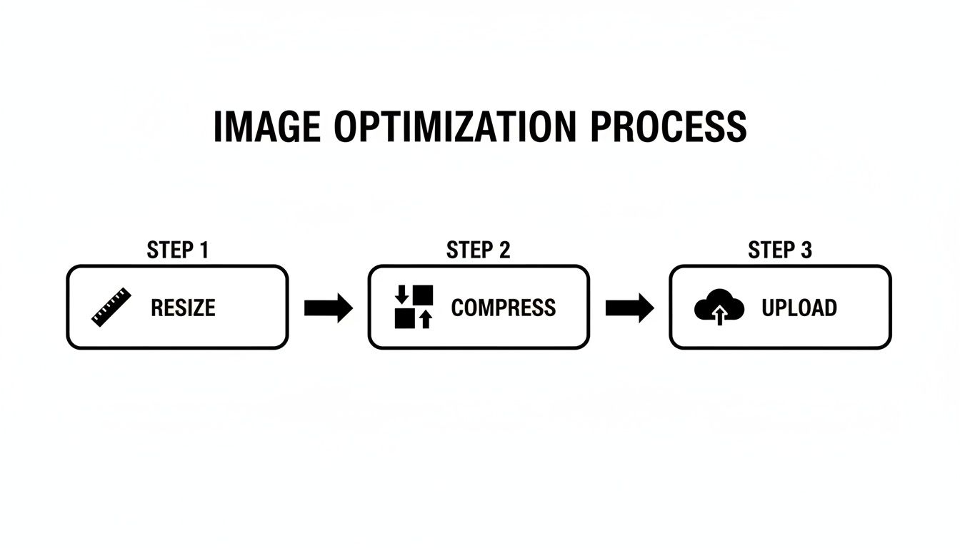
Following this simple three-step process for every single image is the bedrock of a high-performing website.
Turning Images into SEO Assets
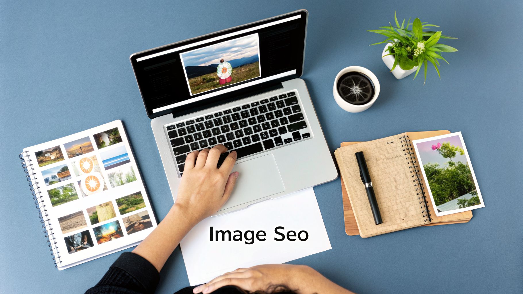
Fast-loading images are a great start, but what if they could also act as magnets for new traffic? By focusing on image SEO, you can turn every visual on your site into a hard-working asset that boosts your visibility and brings in qualified leads.
This isn’t just about speed; it's a goldmine for search engine rankings. When Google’s crawlers scan your site, they can’t actually “see” your pictures. They rely on the text you provide to understand what an image is about. This is your chance to start ranking in Google Images—a massive and often-overlooked source of traffic.
We’ll focus on the three pillars of solid image SEO: descriptive filenames, keyword-rich alt text, and submitting an image sitemap.
Write Descriptive, Keyword-Rich Filenames
This first step happens before you even upload a single file. Your camera or phone spits out generic, meaningless names like IMG_DC1234.jpg or screenshot-2024-08-15.png. To a search engine, these names mean nothing at all.
Renaming your files with descriptive, keyword-focused language is the first clue you give Google about an image’s content. Think about the exact terms a potential customer would use to search for what's in that picture.
Here's an actionable example:
- Original Filename:
IMG_2034.jpg - Bad Filename:
photo1.jpg - Good Filename:
custom-kitchen-remodel-naples-fl.jpg - Actionable Step: Before uploading, open the folder with your website images. Right-click on
IMG_2034.jpgand select "Rename." Change the name tocustom-kitchen-remodel-naples-fl.jpg. Now it's ready to upload.
That simple change connects your image directly to a valuable local search. It’s a tiny bit of effort that pays off in a big way for your SEO.
Craft Alt Text That Helps Everyone
Alt text (or alternative text) is the single most important part of image SEO. It’s a simple HTML attribute that describes an image for two critical audiences: search engines and visually impaired users who rely on screen readers.
A well-written alt text is descriptive and includes your target keyword in a natural way. This not only helps Google index your image correctly but also makes your website more accessible for everyone.
Your goal with alt text is to describe the image as if you were explaining it to someone over the phone. Be specific, but keep it concise—aim for under 125 characters.
Let’s look at some real-world examples for a local business in Fort Myers.
- Weak Alt Text:
alt="paving services" - Good Alt Text:
alt="Asphalt driveway paving for a new home in Fort Myers, FL." - Excellent Alt Text:
alt="Newly paved black asphalt driveway with a clean, smooth finish in a residential Fort Myers neighborhood." - Actionable Step: In your WordPress media library or Shopify product page, find the "Alternative text" field for your image. Instead of just writing "paving," copy and paste the "Excellent" example. This gives Google and screen readers the perfect context.
That last example is perfect. It paints a clear picture for screen readers and signals to Google that this image is highly relevant for searches like "asphalt paving in Fort Myers." For a deeper dive into on-page optimization, our small business SEO checklist is an excellent resource to ensure all your bases are covered.
Submit an Image Sitemap
Finally, to make absolutely certain that Google finds and indexes every single visual on your website, you can submit an image sitemap. Think of it as a direct roadmap you hand to search engines, listing all the images on your site.
Most modern SEO plugins for WordPress, like Yoast SEO or Rank Math, will generate an image sitemap for you automatically. You just need to make sure the feature is turned on in the settings.
- Actionable Step for Yoast SEO: Go to your WordPress dashboard, navigate to
Yoast SEO>Settings>Advanced>Media. Ensure the "Image sitemap" toggle is switched on. The plugin will handle the rest.
Taking this step ensures that even images loaded with JavaScript or tucked away in galleries get discovered by Google. This maximizes your chances of showing up in image search results and driving more organic traffic straight to your business.
A Few Final Questions on Image Optimization
Even with a step-by-step guide, you probably have a few more questions. That’s a good thing—it means you’re thinking about how these steps apply to your own website. Getting images right involves a few different pieces, so let's clear up some of the most common questions we hear from business owners just like you.
What's the Ideal File Size for a Web Image?
There’s no single "magic number" for every image, but we've found that a great target for most website images is under 200KB. This is a solid rule of thumb for your standard blog post photos, e-commerce product shots, or gallery pictures.
Of course, there are always exceptions. A massive, full-width hero image at the top of your homepage might need to be 300KB or even 400KB to look sharp and impressive. On the other hand, smaller graphics like thumbnails should be much, much smaller—aim for 100KB or less.
The real goal is to find that sweet spot where you’ve shrunk the file size without hurting the visual quality. Pull up your compressed image next to the original. If you can't tell the difference, you’ve done it right.
Do I Really Need to Optimize Images for WordPress or Shopify?
Yes, you absolutely do. This is a huge misconception we see all the time, and it can seriously drag down your site speed. While modern platforms like WordPress and Shopify have some great built-in features, they don't do all the work for you.
Here’s what these platforms typically handle on their own:
- Creating Responsive Sizes: They automatically generate smaller versions of your uploaded image to serve the right one to different screen sizes using
srcset. - Lazy Loading: They usually add the
loading="lazy"attribute so images "below the fold" don't slow down your initial page load.
The catch is, they can only work with the file you give them. If you upload a giant, uncompressed 4MB photo straight from your camera, the platform will use that massive file as its starting point. You still need to resize your images to the right dimensions (like 1200px wide for a blog post) and compress them before you hit that upload button.
Should I Use an Online Tool or an Automated Plugin?
Both are great, and honestly, the best workflow often involves a combination of the two. It really just depends on the image and how much time you have.
Online Tools (like Squoosh or TinyPNG):
These are your go-to when you need absolute control. For your most important images—think homepage hero shots or your top-selling product photos—manually compressing them lets you dial in the quality settings perfectly. You can get the smallest possible file with zero noticeable quality loss.
Automation Plugins (like ShortPixel or Smush for WordPress):
These are lifesavers for efficiency. A good plugin can automatically compress every single image you upload and even go back and optimize your entire existing media library. For busy blogs or sites with tons of product photos, this is a non-negotiable.
A pro-level workflow usually looks like this: manually optimize your critical "money" images for maximum performance, and let a trusted plugin handle the day-to-day work on everything else. This hybrid approach gives you the best of both worlds—peak performance where it matters most and great efficiency across the board.
Ready to stop losing customers to a slow website? The team at Polaris Marketing Solutions builds high-performance websites and creates customized SEO strategies that turn your online presence into a lead-generating machine. We bring real-world small business experience to help you grow. Get your free competitor analysis and see how you stack up.