
A Fort Myers contractor can do everything right inside Google Ads, choose relevant keywords, write a strong offer, and still pay for clicks that go nowhere. The visitor taps an ad for “Emergency Roof Leak Repair,” lands on a generic homepage, sees no emergency-service headline, and has to search for proof, pricing context, and a way to call. On a phone, that extra effort is often enough to end the visit.
That's why PPC landing page optimization should be treated as a Quality Score lever first and a conversion-rate lever second. The page needs to confirm relevance to Google and to the person who clicked. Then it needs to make the next action obvious, fast, and trustworthy.
Why Your PPC Clicks Are Not Converting
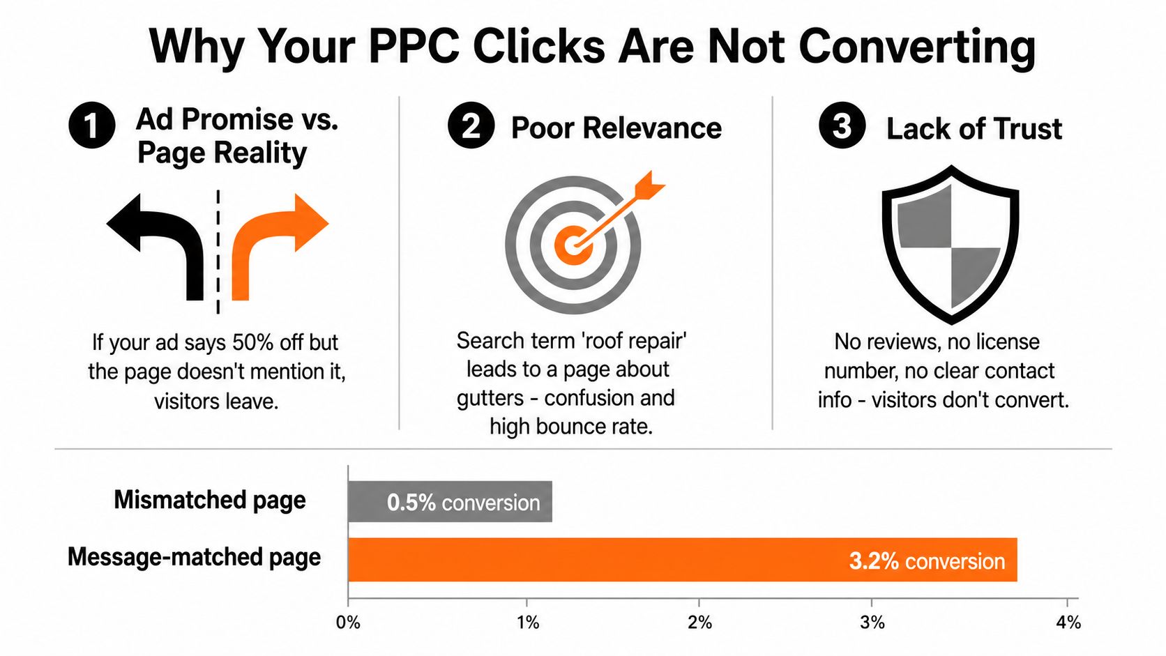
A roofing company can buy hundreds of clicks and generate almost no qualified leads when the post-click experience breaks the promise made in the ad. The bid strategy gets blamed because it's visible in the account, but the problem often sits between the ad and the form.
An ad promising emergency roof repair should lead to a page that immediately names emergency roof repair, explains the response process, shows relevant local proof, and offers a direct next step. A homepage with roofing, gutters, windows, financing, testimonials, and a dozen navigation choices makes the visitor work too hard. Google's landing page experience guidance focuses on whether the destination is relevant and useful to people who click the ad.
Start with the full click path
Review these elements in order:
- Search term: What did the person type?
- Keyword: Which intent group triggered the ad?
- Ad promise: What benefit, service, location, or urgency did the ad communicate?
- Headline: Does the first screen repeat that promise?
- Offer: Is the visitor getting the expected estimate, consultation, or emergency response?
- Form and CTA: Can the person complete the next step without confusion?
Separate brand, service, location, and emergency campaigns instead of sending every audience to the same page. A Fort Myers emergency-repair visitor has a different need from someone researching roof replacement costs. A commercial buyer also shouldn't land on a residential-service form.
Measure business outcomes, not just clicks
Track qualified calls, completed forms, booked jobs, cost per qualified lead, and conversion rate by campaign and device. Check tracking before rewriting the page. A broken form, duplicate conversion tag, unavailable destination, or slow mobile page can erase the value of excellent copy.
Form behavior deserves its own inspection. If visitors begin but don't finish, these practical form backend form abandonment tips can help identify technical and usability issues before you change the whole design.
Practical rule: Fix relevance, availability, tracking, speed, and mobile usability before polishing button colors.
Use a controlled test after the basics work. Change one major variable at a time, such as the headline, CTA, form length, or proof placement, and keep the winning version tied to the campaign intent that produced it. That sequence protects ad relevance while making the path from paid click to revenue easier to diagnose.
Meeting Google's Landing Page Experience Standards
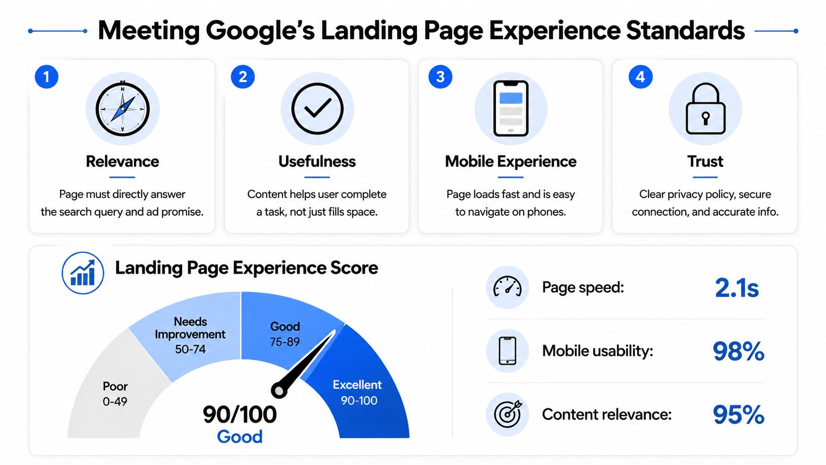
Google's landing page experience assessment isn't a plugin you install or a single page score you can repair overnight. It reflects whether the destination is relevant, useful, easy to use, mobile-friendly, and transparent for the person who arrived from the ad.
Google's destination requirements say ad destinations must be safe and easy to use. The landing page and display URL must also use the same domain, so sending traffic to an unrelated destination creates an avoidable relevance and trust problem.
Build for the visitor first
The first screen should answer four questions quickly:
- What service is this?
- Is it available in my location?
- Why should I trust this business?
- What happens when I click or submit?
Use a responsive layout, readable text, stable content, clear buttons, and a form that works on a phone. Keep the primary offer visible without forcing the visitor through a menu or an intrusive overlay. State what happens after submission, such as whether a team member will call, when the estimate is provided, or what information the visitor should prepare.
Trust signals should be accurate and specific. Depending on the business, that may include licensing, insurance, reviews, guarantees, local project evidence, privacy language, and a secure connection. Don't add badges or claims the company can't substantiate.
Run a pre-launch compliance check
Before sending traffic, confirm:
- Destination: The URL resolves correctly and the page stays on the same domain.
- Relevance: The headline reflects the keyword and ad promise.
- Offer: The page presents the same service, qualification, or incentive shown in the ad.
- Usability: The form, buttons, phone links, and confirmation flow work on mobile.
- Navigation: Unnecessary menus and exit paths are removed from a focused lead page.
- Performance: Images are compressed, scripts are reviewed, and field performance is inspected.
- Policy: Claims, pricing language, and promotional elements are clear and supportable.
- Tracking: The conversion fires once, not twice, after the intended action.
Google's destination rules also prohibit intrusive ad experiences that obscure the main content, use autoplaying video ads with sound, rely on countdown interstitials, or cover the page with obstructive overlays, as summarized in Google's updated intrusive-ad destination coverage. A clean page with the core content visible immediately is safer for both users and policy review.
Building Message Match Before You Touch the Design
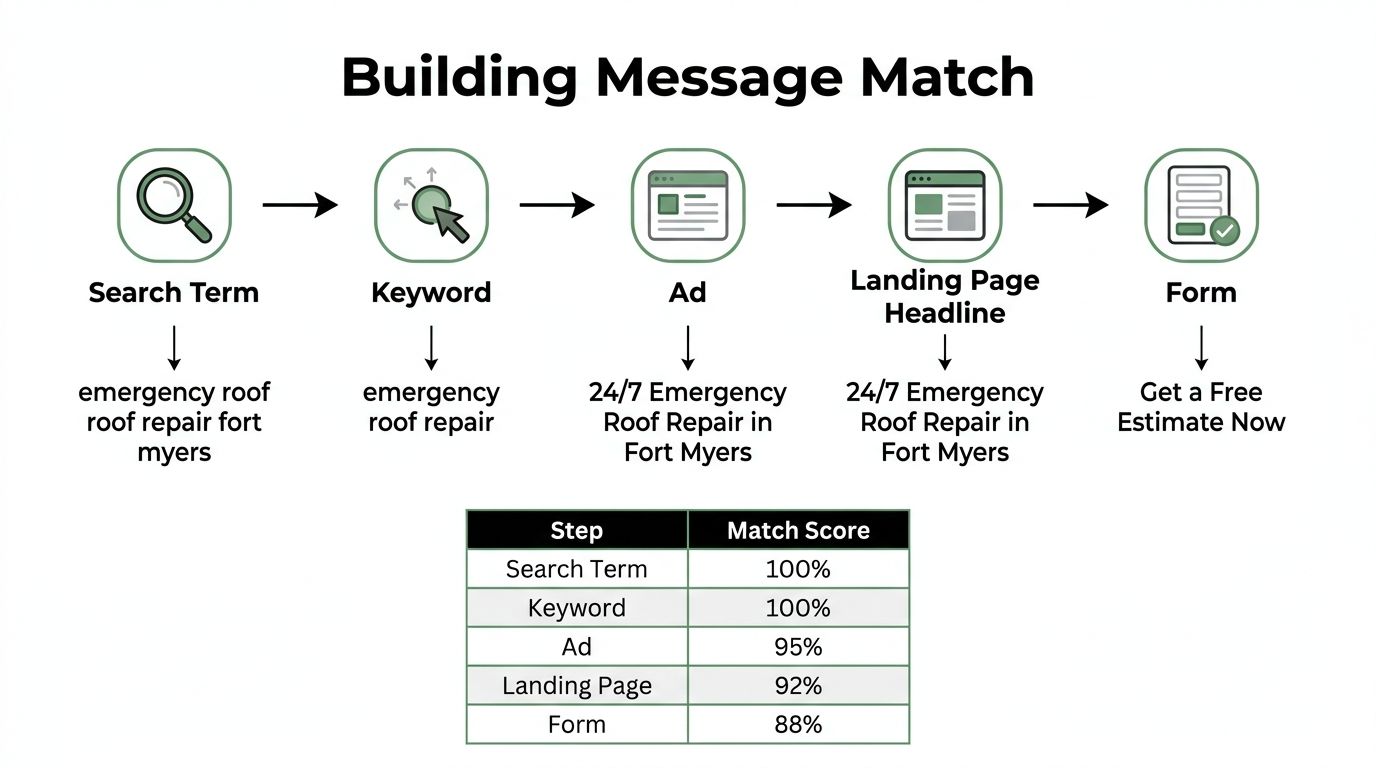
Start with a message match matrix, not a color palette. The matrix carries one promise from the search term through the keyword, ad, landing-page headline, supporting copy, offer, CTA, form, and confirmation message.
A universal homepage usually fails because it tries to serve every intent. Each ad group needs a dedicated page or a highly relevant page section. The page doesn't need to repeat a keyword mechanically, but it does need to make the visitor feel they clicked the right result.
A Cape Coral roofing example
Build the campaign around intent rather than one broad roofing page:
| Search intent | Page angle | Hero CTA |
|---|---|---|
| Emergency roof leak repair | Fast-response service page | Request Emergency Service |
| Roof replacement cost | Estimator and qualification page | Get a Replacement Estimate |
| Metal roofing | Installation page with relevant project evidence | Schedule a Metal Roof Consultation |
Begin with the search-term report. Group terms by urgency, service, location, and customer knowledge, then map each group to one page angle. Separate residential and commercial roofing, even when the services overlap. A commercial prospect expects different proof, project context, and qualification questions.
Map every message element
For each ad group, document:
- Headline: Include the service, city, and primary benefit when that wording sounds natural.
- Subheadline: Deliver the specific promise made in the ad.
- Offer: Repeat the estimate, consultation, response, or qualification expectation in the first screen.
- CTA: Use consistent language in the ad, hero section, form button, and confirmation.
- Proof: Put reviews beside the CTA, licensing and insurance near the form, and project examples next to the relevant service.
- Exclusions: Keep unrelated services and audiences out of the page.
Don't turn the page into a keyword dump. Message match means clarity, not repetition. If the ad says “24/7 Emergency Roof Repair in Fort Myers,” the landing-page headline should make that service and location immediately obvious. The form button can then say “Get a Free Estimate Now” only if that's what the visitor receives.
A faster page with the wrong promise is still the wrong page.
The visual design comes after the matrix. A polished page can't rescue a mismatch between “roof replacement estimate” and a page focused on emergency repairs. Test the promise before testing decoration.
Speed and Mobile UX That Lift Quality Score
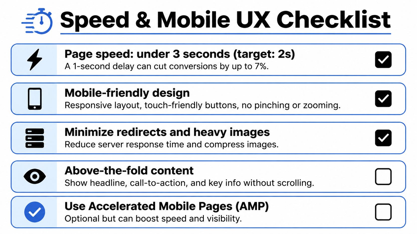
Speed is a conversion issue before it's a design issue. Widely cited performance research reports that a one-second delay can cut conversions by about 7%, while pages loading in under 1.5 seconds can convert 2.4 times better than pages loading in 4 seconds, as documented in this landing page speed and conversion analysis.
The same source reports mobile landing pages converting at 4.1% versus 6.3% on desktop, a 35% gap. Smaller screens, slower connections, crowded forms, and intrusive overlays create more friction on the device many local prospects use when they need a contractor quickly.
Audit the technical layer in priority order
A contractor or marketing manager can make a useful first pass without redesigning the site:
- Load the hero quickly. Compress the main image, serve modern formats such as WebP, and remove visual assets that don't support the offer.
- Defer non-critical scripts. Review chat tools, heatmaps, analytics, sliders, and tracking libraries. Keep what you need, but don't let every script compete with the first interaction.
- Control video. Lazy-load below-the-fold video and avoid making a large background video responsible for the first screen.
- Use a lightweight mobile template. Keep the headline, proof, phone button, and form easy to reach.
- Remove mobile blockers. Disable auto-opening chat widgets and full-screen pop-ups that cover the CTA.
- Check tap behavior. Buttons and links should be comfortable to use without precision tapping or accidental clicks.
Google's current performance guidance commonly centers on Largest Contentful Paint under 2.5 seconds, and recent coverage reports that each second beyond that threshold can reduce conversions by 7%, according to landing page performance benchmarks from Sender.
Use field experience, not just lab scores
A perfect Lighthouse result on a desktop connection doesn't guarantee a smooth visit for someone on a throttled Southwest Florida mobile connection. Compare real device behavior, form interaction, layout stability, and click-to-call performance. Watch for hero images that push the CTA down, sticky bars that cover form fields, and scripts that load after the page appears but freeze interaction.
Speed improvements usually work best alongside message match. A fast page can reduce technical waste, but it won't make an irrelevant offer persuasive. Use Core Web Vitals optimization guidance when the audit shows performance problems, then return to the campaign data and confirm whether qualified lead behavior improved.
Forms, CTAs, and Page Layout That Convert
The form decides whether a paid click becomes a conversation or disappears. On lead-generation pages for roofing, HVAC, paving, cleaning, legal, and professional services, the most common mistake is asking for information the sales team doesn't need before making contact.
An 11-field roofing form cut to 5 fields lifted conversion 31% while lead quality held, because the remaining qualification questions moved to the phone call. That example is part of the required campaign pattern here, but it shouldn't become a universal promise. The right form length depends on the offer, sales process, urgency, and whether the business can qualify efficiently after submission.
Reduce fields without removing useful context
Keep the first form focused on what the team needs to respond:
- Name: Identify the person.
- Phone: Create a direct response path when calls matter.
- Email: Send confirmation or estimate details.
- Service needed: Route the lead correctly.
- Location or project context: Confirm serviceability and basic fit.
A form for emergency service may need less information than a consultation page. Don't ask for budget, detailed project scope, preferred appointment windows, and extensive notes if the first call can collect those details. Explain why sensitive information is requested, and tell the visitor what happens after submission.
Give the page one reading path
A useful mobile layout looks like this:
- Hero: Matched headline, concise benefit, and one primary CTA.
- Trust bar: Reviews, licensing, insurance, service area, or relevant proof.
- Benefits: Explain the outcome and process in short, scannable blocks.
- Social proof: Place a relevant review near the objection it answers.
- Form or call section: Repeat the same primary action lower on the page.
- Sticky mobile bar: Keep click-to-call visible without covering content or form controls.
A single CTA works better for cold paid traffic than a menu of equally prominent options because it removes the decision about what to do next. A secondary phone link can support the primary action, but don't give “Get a Quote,” “Read Our Blog,” “View Services,” “Chat Now,” and “Book Online” the same visual weight.
Remove familiar friction traps
Auto-opening chat widgets interrupt the visitor before they understand the offer. Exit-intent modals on a first visit add another decision at the moment someone is already leaving. Multi-step forms without a progress indicator create uncertainty, especially when the first step asks for information that feels unrelated.
Use real service photography or project evidence when it helps the visitor judge the work. Generic stock photos can make a local contractor look interchangeable. A practical landing page layout reference with high-converting examples can help a designer translate the structure into a usable page without copying a template blindly.
Running A/B Tests That Actually Move the Needle
A useful test starts with a mechanism, not a preference. Write the hypothesis this way:
Changing X to Y for visitors from [ad group] will lift form submissions by Z% because [mechanism].
For example, “Changing ‘Submit' to ‘Request Emergency Service' for emergency roof-repair visitors will lift completed forms because the button will match the urgency and service promised in the ad.” The hypothesis forces the team to define the audience, action, expected outcome, and reason.
A baseline conversion rate of 4% with a target of a 20% relative lift means testing toward 4.8%, not 24%. For a Fort Myers HVAC account receiving 800 clicks per month, the supplied testing plan uses roughly 3,500 visitors per variant and at least two full business weeks before reading results. Treat that as a planning example, not a guarantee of statistical validity for every account.
Prioritize tests by likely impact
Test in this order:
- Headline and offer match
- CTA wording
- Hero image or service evidence
- Form length
- Social proof placement
Don't test headline, form, hero image, and CTA in the same variation if you want to understand why the result changed. Teams looking for a broader framework can review revenue-driven landing page testing while keeping the actual experiment tied to qualified business outcomes.
| Baseline CVR | Target CVR, 20% lift | Visitors per variant | Est. test duration at 800 clicks/month |
|---|---|---|---|
| 2% | 2.4% | Plan from account traffic and required confidence | Longer than a high-baseline test |
| 4% | 4.8% | About 3,500 in the supplied example | At least two full business weeks |
| 6.6% | 7.92% | Calculate before launch | Depends on allocation and traffic quality |
Use a 60-day operating calendar
Days 1 to 15: Audit tracking, confirm the baseline, and launch the headline-match test. Split eligible traffic evenly and keep campaign targeting stable.
Days 16 to 30: Review the first test only after the planned evidence threshold is met. If the result is inconclusive, keep the original and document the learning instead of forcing a winner.
Days 31 to 45: Test CTA language against the best available headline. Segment the readout by device, brand versus non-brand intent, and relevant service group.
Days 46 to 60: Test form length or proof placement. Measure qualified leads and booked jobs, not form submissions alone.
Stop when the test reaches the preselected statistical confidence threshold, when a tracking defect invalidates the data, or when the page creates a material business or policy problem. Don't call a winner after three days because one version has a temporary lead. Feed the winning landing-page language back into ad copy testing so the promise stays aligned across the entire click path.
Tracking, Reporting, and Your 30-Day Optimization Plan
A landing page can appear healthy while producing poor business results if the account counts every form fill as a conversion. Separate qualified leads, junk submissions, answered calls, booked appointments, and sales-qualified opportunities so optimization rewards useful demand rather than cheap activity.
Google Ads conversion tracking should connect the click to the action and then to the business outcome. The setup may include a Google tag on the thank-you page, enhanced conversions using hashed email matching, and offline imports for sales-qualified leads. Microsoft Clarity or Hotjar recordings can reveal where visitors hesitate, abandon fields, or tap a non-clickable element, but recordings should support conversion data rather than replace it.
Report by page and audience
Create a weekly view that includes:
- Landing-page URL: Identify which destinations receive traffic and qualified outcomes.
- Campaign and keyword intent: Separate brand, service, location, emergency, and research traffic.
- Device: Compare mobile and desktop behavior.
- Quality Score components: Watch landing-page relevance alongside ad relevance and expected performance.
- Business outcome: Track qualified cost per lead, booked jobs, and assisted conversions.
- Change log: Record the date, hypothesis, page version, and campaign affected.
Unbounce's benchmark data, published in 2024 from 41,000-plus landing pages, 464 million visits, and 57 million conversions, places the median landing-page conversion rate at 6.6% across industries, as summarized in this PPC landing-page benchmark analysis. Use that as a broad reference, not as a target that overrides intent, device, service type, or lead quality. The same benchmark guidance identifies the top 25% beginning around 11.4%, while elite pages can exceed 20% depending on traffic quality and intent, according to Unbounce's conversion-rate benchmark guidance.
A practical 30-day plan
| Week | Focus | Key tasks | Success metric |
|---|---|---|---|
| Week 1 | Audit and tracking | Verify forms, calls, tags, destinations, and page-level reporting | Reliable qualified-lead baseline |
| Week 2 | Message match | Align search terms, ads, headlines, offers, and CTAs | Stronger relevance and cleaner campaign segmentation |
| Week 3 | Speed and mobile | Compress assets, review scripts, test forms and tap behavior | Fewer technical and mobile drop-offs |
| Week 4 | First experiment | Launch one hypothesis-led A/B test with a defined success metric | Valid comparison based on qualified outcomes |
Small businesses often gain more from fixing the click path than from adding another campaign. Polaris Marketing Solutions provides PPC campaign support that can include service-specific landing pages, focused lead forms, conversion tracking, and post-click optimization for local businesses in Southwest Florida. Visit Polaris Marketing Solutions to request an online analysis and competitor report, then use the findings to identify which landing page is wasting paid traffic and what to fix first.