

You check your website stats at the end of the week. People are landing on your service pages. Some are even spending time there. But the phone isn't ringing much, quote requests feel inconsistent, and the jobs you expected from that traffic never materialize.
That usually isn't a traffic problem. It's a friction problem.
For a local service business, user experience optimization means removing the little obstacles that stop someone from calling, booking, or filling out your form. A confusing menu, a slow mobile page, a form that asks too much, or a phone number that isn't easy to tap can impede revenue. If you're trying to turn website traffic into booked jobs, UX is often the missing layer between visibility and actual sales.
Small businesses don't need enterprise software or a full redesign to fix this. They need a site that answers basic questions fast, works well on a phone, and makes the next step obvious. If visitors leave quickly, this guide on how to reduce website bounce rate is useful because bounce problems and UX problems usually overlap.
Why Your Clicks Are Not Turning into Customers
A homeowner finds your site from Google, taps through on their phone, and wants an answer fast. Can you fix the problem, do you work in their area, and what is the next step? If those answers are not obvious right away, the click you paid for or worked to earn starts losing value within seconds.
That is the actual conversion gap for many local service businesses.
User experience optimization is the work of removing hesitation from the path to contact. For a plumber, roofer, electrician, or HVAC company, that usually has very little to do with trendy design choices. It comes down to whether someone can reach you quickly, trust what they see, and take action without effort.
On a small business budget, that distinction matters. Owners often assume they need more traffic to get more leads, but a lot of local sites already get enough visits to produce better results. They just make people work too hard after the click. If your goal is to turn website traffic into booked jobs, fixing that path usually pays back faster than chasing another marketing channel.
What friction looks like on a local business site
I see the same problems on service websites over and over, especially on sites that were built to look respectable rather than convert:
- Contact details are hard to find, with the phone number tucked into the footer or buried on the contact page.
- Navigation tries to do too much, mixing service pages, city pages, promotions, and company info into one crowded menu.
- Calls to action are vague, using buttons like “Learn More” or “Submit” instead of a clear next step.
- Mobile pages load slowly, which is costly because many local visitors are searching from a phone when they need help now.
- Forms ask for too much upfront, creating work before the business has earned trust.
None of these issues looks dramatic on its own.
That is why underperforming websites can fool owners for months. The site is not broken. It is just inconvenient in small ways that stack up and lower calls, form fills, and booked estimates. If you have also seen high exits or short visits, this guide on how to reduce website bounce rate is useful because bounce problems and conversion problems often come from the same points of friction.
UX affects revenue before it affects aesthetics
Local prospects are not reading your site like a brochure. They are trying to solve a problem with as little effort and uncertainty as possible. If a competitor makes that easier, the lead often goes there instead.
Analysts at Forrester have long argued that better UX improves conversion and lowers abandonment, and that lines up with what happens on real service sites. A clearer headline, a tap-to-call button that stays visible on mobile, or a shorter quote form can produce more leads without increasing ad spend. For a small business owner, that is the practical case for UX. It is not about polishing the site for its own sake. It is about removing the little blocks that stop ready-to-buy visitors from contacting you.
Finding the Friction with a Practical UX Audit
Most small businesses can audit their own site better than they think. You don't need a giant report. You need a realistic walkthrough and a short list of fixable problems.
Demystify your website's user experience with this simple, actionable audit.
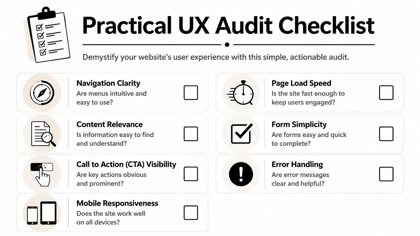
Start with the mindset of a first-time customer, not the owner who already knows where everything is. Open your site on your phone, turn off Wi-Fi, and try to complete one task. Find the phone number. Find the service area. Request a quote. Book an appointment. If anything feels annoying to you, it's probably worse for a stranger.
Run the audit like a customer, not a designer
Use this simple sequence:
Land on the homepage
Ask yourself whether a new visitor can tell what you do within a few seconds. If you run an HVAC company, the homepage should make that obvious immediately. Don't force people to decode slogans.Try the menu
Look for clutter. If the navigation includes every service, sub-service, blog category, and company page, people have to think too much. For most local businesses, fewer top-level choices work better.Test contact paths
Tap the phone number. Tap the address. Click the main CTA. If any of those actions fail, lag, or feel indirect, log it.Fill out your own form
Time how long it takes. Check whether the required fields are necessary. Review the error messages. If you want a good reference on form validation and mobile design, that guide is practical and grounded in the details that usually cause abandonment.Review page speed basics
Heavy image files are a common issue on local business sites, especially after years of adding gallery photos and banner graphics. This walkthrough on how to optimize images for web helps with one of the cheapest technical fixes available.
Practical rule: Audit the path to contact before you audit the colors, fonts, or animations.
Look at behavior, not just feedback
Surveys matter, but they don't tell the whole story. Data shows a critical gap between user feedback and behavior, as 70% of what users report is contradicted by analytics according to Alida's article on user experience optimization tips. That's why a customer may say the site was “fine” while their behavior shows fast exits, repeated taps, or abandoned steps.
If you don't have session replay tools, you can still watch for hidden friction manually:
- Repeated tapping on something that looks clickable but isn't
- Quick back-button behavior after landing on a service page
- Dead-end pages with no clear next action
- Mobile pinch-and-zoom because text or buttons are too small
- Form drop-off after a specific field
This video gives a useful walkthrough of what that observation mindset looks like in practice.
Build a friction log
Keep it simple. Open a spreadsheet or notes app and create four columns.
| Issue | Where it happens | Why it matters | Fix idea |
|---|---|---|---|
| Phone number hard to find | Mobile header | Slows urgent callers | Add sticky tap-to-call button |
| Form asks too much | Quote page | Creates effort before trust | Remove nonessential fields |
| Service area unclear | Homepage | Causes uncertainty | Add city list near hero section |
| Images load slowly | Gallery page | Hurts mobile experience | Compress and resize files |
A friction log turns vague frustration into a working list. That matters because websites rarely fail from one dramatic flaw. They fail from several small annoyances stacked together.
Quick UX Wins for Immediate Local Impact
A local service website usually does not need a redesign to get more leads. It needs a few conversion fixes in the places where people decide whether to call, book, or leave.
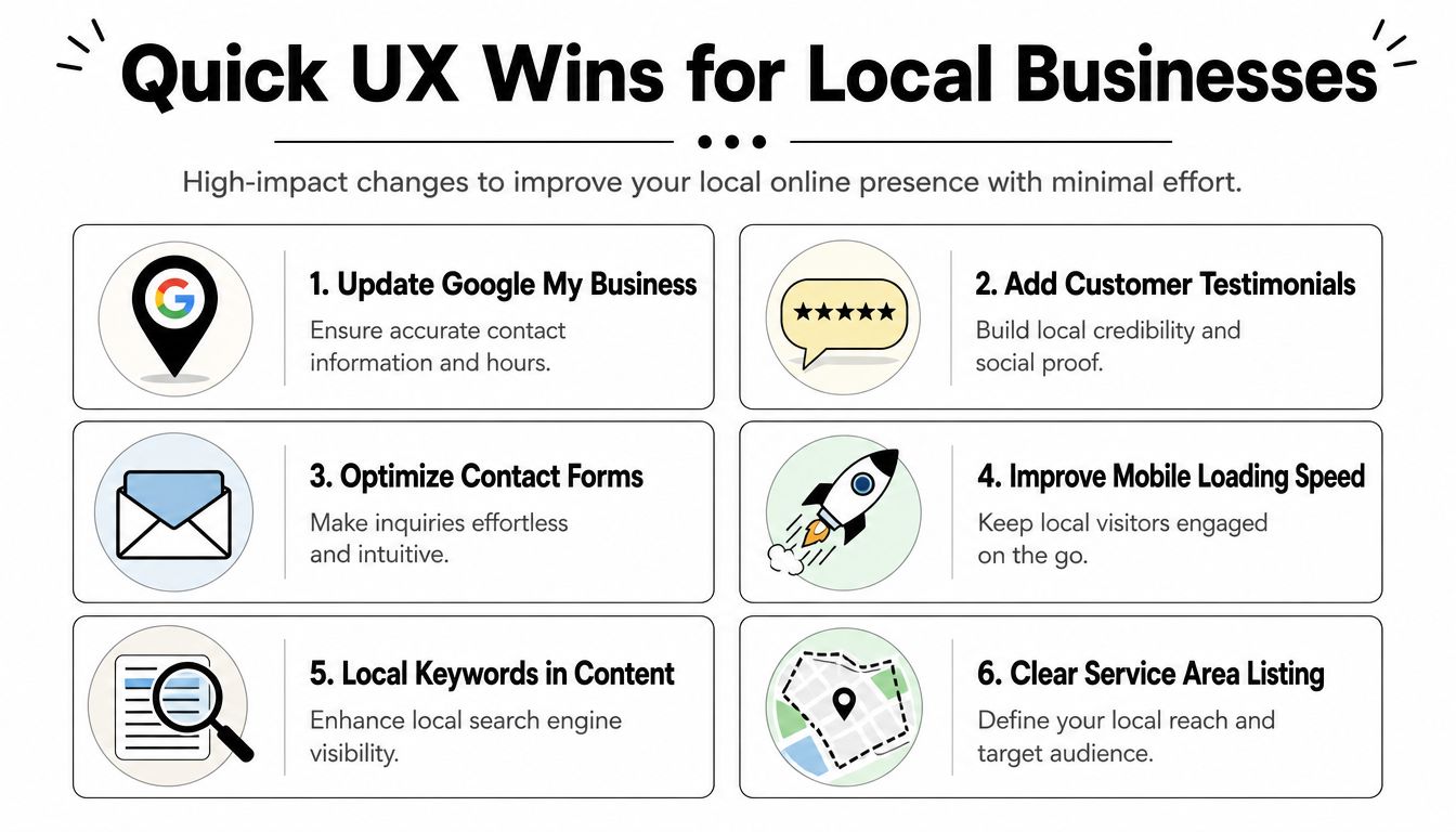
For small business owners with limited time and budget, the best UX work is usually simple. Improve the path to contact. Remove hesitation. Make mobile use easier. Those changes often produce more value than a visual refresh.
Fix the actions that drive local leads
Start with the moments tied closest to revenue. On many local service sites, that means calls, quote requests, directions, and appointment bookings.
A few updates consistently earn their keep:
Make the phone number tap-to-call
Mobile visitors should be able to call with one tap from the header or a sticky button. If someone has to memorize or copy your number, you are creating extra work at the worst moment.Make the address open directly in maps
For offices, clinics, and showrooms, map access matters. Help people get directions without a second search.Cut the menu down to the pages buyers use
A crowded navigation creates hesitation. In many cases, Home, Services, About, and Contact are enough.Use one primary CTA on each page
Every page needs a clear next step, such as “Request a Quote,” “Book Now,” or “Call for Service.” Generic buttons like “Learn More” often underperform on high-intent service pages.Place proof close to the action
Reviews, certifications, financing options, service-area details, and years in business work harder when they appear next to the form or call button.
If the next step is not obvious, conversion drops.
Speed fixes usually pay back fast
Small service businesses often waste money on design extras while slow pages keep leads from ever reaching the contact button. On a phone, every delay feels longer. A heavy hero image, an autoplay slider, or cheap hosting can be enough to lose a ready-to-buy visitor.
The low-cost fixes are straightforward:
Compress oversized images
Staff photos, project galleries, and homepage banners should match the size they display on screen.Remove sliders and oversized video backgrounds
They often slow the page and compete with the main message.Use lighter layouts
Motion effects and layered visuals can look polished, but they often add friction on mobile devices.Review your hosting
If the site drags at busy times, the problem may not be the design. It may be the server.
I have seen service businesses get better lead flow from image compression and a better mobile header alone. Those are not glamorous changes. They are profitable ones.
Match the fix to the business model
The best quick win depends on how customers buy from you.
| Business type | Quick win | Why it helps |
|---|---|---|
| Plumber | Sticky call button on mobile | Helps urgent callers reach you immediately |
| Med spa | Booking button near the top of the page | Captures visitors who are ready to schedule |
| Law firm | Simpler practice area navigation | Helps prospects find the right service faster |
| Cleaning company | Service area list near the homepage intro | Filters out bad-fit leads and reassures local ones |
| Physical therapy clinic | Larger text and stronger contrast | Makes the site easier to read for older visitors |
This is the 80/20 side of UX for local businesses. You do not need enterprise research, a new CMS, or a six-figure redesign to improve results. You need a site that answers key questions fast and makes contact easy on a phone.
Improve conversion before you polish aesthetics
Owners often spend first on fonts, animations, or a homepage refresh because those changes are easy to see. Buyers care more about clarity and speed.
A service website should answer four questions right away. What do you do? Where do you work? How do I reach you? Why should I trust you?
Get those basics right, and the site starts working harder without a bigger budget.
Optimizing Service Websites to Build Trust
A service website succeeds when it reduces uncertainty. That's especially true in industries where the buyer feels risk before they ever make contact.
Think about a homeowner looking for an architect, remodeling contractor, or attorney. They're not just evaluating price. They're trying to decide whether your business feels credible, responsive, and easy to deal with.

Where trust is won or lost
A typical journey reveals the pressure points.
The visitor lands on a service page from search. They scan the headline, look for signs that you handle their type of problem, and start looking for proof. If the page is all self-praise and no evidence, confidence drops fast. If they see recent testimonials, recognizable credentials, clear service details, and a direct CTA, they keep moving.
Then they reach the form.
Many service sites often lose good leads. The form asks for too much, the button says “Submit,” the page gives no reassurance about response time, and there's nothing nearby that reinforces trust. The site feels procedural instead of helpful.
Build forms that feel easy and safe
The best local service forms are short, clear, and specific.
Ask for the minimum
Name, contact info, and a brief project description is often enough for the first step.Use benefit-driven button text
“Get My Free Quote” gives people more confidence than “Submit.”Place trust elements nearby
Trade associations, licenses, insurance notes, awards, and review snippets should sit close to the form, not miles away in the footer.Explain what happens next
A short note like “We'll review your request and respond during business hours” reduces uncertainty.
A form isn't paperwork. It's the moment someone decides whether your business feels easy to work with.
Ask abandoning visitors what stopped them
One of the most practical tactics for service businesses is also one of the cheapest. To discover why users don't convert, use page-level or exit surveys to directly ask, “What prevented you from taking action today?” or “Were you able to complete your goal?” That guidance comes from American Eagle's UX article, and it works because the responses are often blunt and useful.
You might learn things like:
- The quote form felt too long
- I couldn't tell if you serve my area
- I wanted pricing guidance before contacting you
- I wasn't ready to call during work hours
- I couldn't find your weekend availability
Those answers help you fix the actual blocker instead of guessing. If people say the form is too long, shorten it. If they're unsure about your service area, add city names high on the page. If they need trust before reaching out, place testimonials and credentials closer to the action point.
Trust signals that actually help
Some trust elements are decorative. Others do real work.
| Strong trust signal | Why it matters on a service site |
|---|---|
| Recent customer testimonials | Shows current proof, not old praise |
| License and insurance details | Lowers perceived risk |
| Clear service area information | Prevents wasted clicks |
| Staff photos or team introductions | Adds accountability |
| Simple response expectations | Reduces fear of being ignored |
The point isn't to pile on badges. The point is to answer the silent questions people ask before contacting a local service business.
How to Measure and Prioritize UX on a Budget
You don't need a massive analytics stack to manage user experience optimization. You need a few meaningful measures and a disciplined way to choose what to fix first.
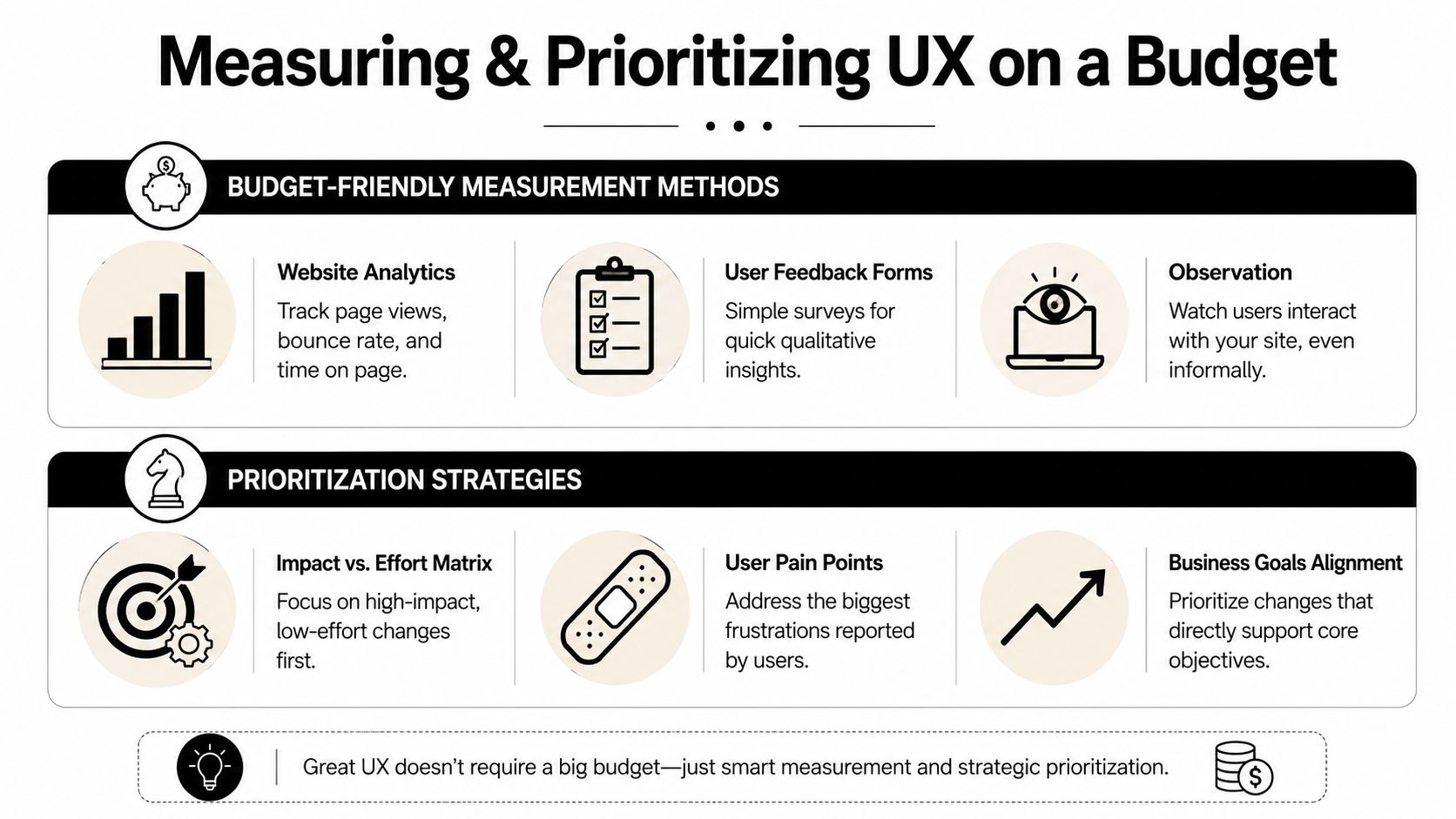
Start by tracking actions that matter to revenue. For a local service business, that usually means phone clicks, form submissions, appointment requests, and direction requests. If you can't tie site behavior to lead behavior, it becomes too easy to waste time tweaking low-value details.
Measure the tasks people came to complete
Useful UX metrics don't have to be fancy. Track metrics like task success rate, error rate, and time on task, and when you test changes, measure over a 2–4 week period to avoid bad decisions caused by short-term noise, as explained in Survicate's guide to UX optimization.
For a local business, that might look like this:
Task success rate
Can a visitor successfully request a quote, place a call, or book an appointment?Error rate
Are users hitting form errors, broken links, or dead buttons?Time on task
How long does it take to complete a core action?Lead actions by page
Which service pages produce actual inquiries?
If you're trying to connect these decisions to business performance, this guide on how to measure marketing ROI helps frame website improvements in terms owners care about.
Use an impact versus effort filter
Not all UX work deserves equal attention. A simple matrix keeps you honest.
| Priority type | Example | Decision |
|---|---|---|
| High impact, low effort | Fix broken phone link | Do first |
| High impact, medium effort | Shorten quote form | Schedule soon |
| Medium impact, low effort | Improve CTA wording | Test quickly |
| High impact, high effort | Full site redesign | Plan carefully |
| Low impact, high effort | Custom animation effects | Skip for now |
This prevents a common small-business mistake. Owners often spend weeks discussing branding details while obvious friction stays untouched.
A broken path to contact beats a mediocre visual design every time. Fix function first.
Be careful with testing
Testing is useful, but only when the setup makes sense. One of the cleaner frameworks comes from UXCam: define the target metric, audit funnels for drop-offs, review non-converter behavior, identify friction like rage taps or dead clicks, form a hypothesis, and prioritize fixes by impact divided by engineering effort. UXCam also notes that if a site has 5,000+ sessions per variant weekly, tools like Statsig or Optimizely are appropriate, while lower-traffic sites can rely on a 4-week before-and-after comparison with cohort controls in many cases, as outlined in their UX optimization methodology.
That's a useful trade-off for local businesses. If your traffic is modest, don't force complicated A/B tests that won't reach clear conclusions. Make one meaningful change, document it, and compare performance carefully over a stable period.
Making User Experience an Ongoing Habit
The businesses that get the most from user experience optimization don't treat it like a one-time cleanup. They treat it like routine maintenance.
The working cycle is simple. Audit the site. Prioritize the issues. Fix the obvious friction. Measure what changed. Then repeat. That rhythm matters more than chasing perfection, because small improvements compound over time.
Start with one or two items from your friction log. Fix the mobile phone button. Shorten the quote form. Clarify your service area. Those kinds of updates are manageable, affordable, and tied directly to how local customers behave.
This discipline is worth it. Every $1 invested in UX can yield $100 in return, which equals a 9,900% ROI, according to UXtweak's UX statistics roundup. Even if your business is nowhere near enterprise scale, the lesson holds. Better user experience usually means less friction, better lead flow, and more value from the traffic you already worked hard to earn.
If you also like studying how customer journeys are improved in other industries, these B2B SaaS customer experience strategies are worth reviewing. The business model is different, but the core principle is the same. Remove obstacles, build trust, and make the next step easier.
If you want help identifying the highest-impact fixes on your website, Polaris Marketing Solutions works with small and mid-sized businesses to improve visibility, conversions, and lead quality through practical website, SEO, and digital marketing improvements. A focused review can often uncover the simple UX issues that are holding back calls, form submissions, and booked jobs.