

A lot of Southwest Florida business owners are in the same spot right now. Their site looks fine on a desktop, the logo is in place, the colors match the truck wrap, and yet the phone still isn't ringing the way it should. In Fort Myers, Cape Coral, Estero, Bonita Springs, and Naples, that gap matters because buyers don't give local service businesses much time. They search, scan, compare, and contact the company that feels easiest to trust.
That's why a generic site is a liability. A roofer, family law firm, med spa, HVAC company, or cleaning service doesn't need a website that wins compliments from friends. It needs a website that helps someone book, call, or request an estimate without friction. Good design isn't decoration. It's part sales process, part customer service, part reputation management.
The strongest web design best practices today reflect that shift. Mobile use dominates browsing behavior, users judge sites almost immediately, and weak design choices create real drop-off. If your site is hard to use on a phone, loads slowly, buries your service areas, or makes contact harder than it should be, you're likely losing leads before your team even gets a chance to respond.
What follows is a practical list built for local service businesses, especially the ones competing in Southwest Florida where trust, speed, and local relevance matter more than trendy visuals. Each point includes a real-world way to apply it, whether you run a plumbing company in Fort Myers, a personal injury practice in Naples, or a healthcare office serving patients across Lee and Collier County.
1. Mobile-First Responsive Design
Mobile-first design isn't a trend anymore. It's the baseline. One industry compilation reports that over 61% of global website traffic came from mobile devices in 2024, and around 90% of websites had implemented responsive web design by 2024, according to web design statistics compiled by VWO.
For a Southwest Florida service business, that changes how the homepage should be built. A homeowner with a leaking water heater in Fort Myers isn't studying your desktop layout. They're on a phone, likely with one hand, trying to see if you serve their area and how fast they can reach you. If your header is crowded, your buttons are tiny, or your text forces pinching and zooming, the site is working against you.
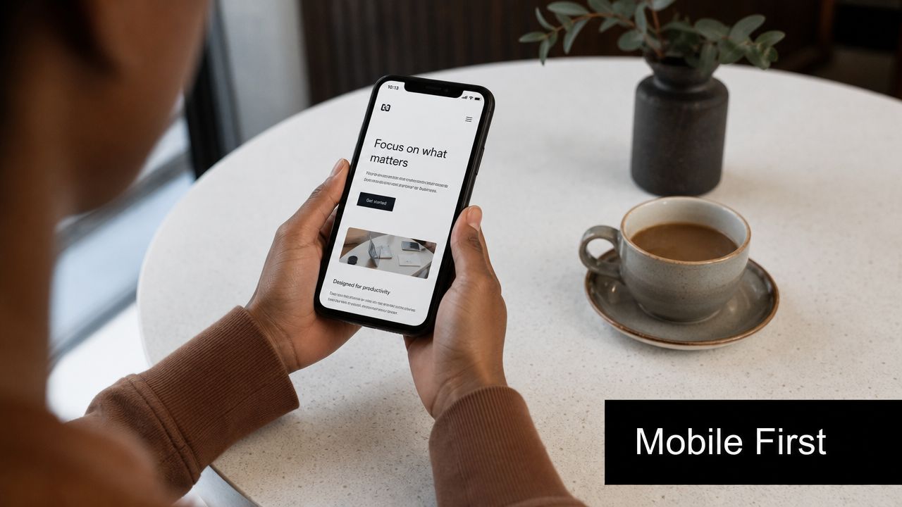
What this looks like in practice
A Cape Coral roofing contractor should place the phone number, service area, and quote button near the top of the mobile screen. A Naples law firm should make office locations, practice areas, and consultation actions easy to tap. A medical office should make scheduling and insurance information visible before the user scrolls too far.
Practical rule: Design the phone version first, then expand to desktop. Not the other way around.
A few details matter more than most owners expect:
- Use thumb-friendly targets: Buttons, menu items, and forms should be easy to tap without precision.
- Keep the first screen useful: Show the core offer, primary action, and location context immediately.
- Test on real phones: An emulator won't show you how a page feels on weak signal, bright sun, or a smaller screen.
- Cut desktop-only clutter: Hover effects, oversized menus, and decorative extras often break the mobile experience.
Responsive design works best when it's paired with restraint. Most local businesses don't need more mobile features. They need fewer obstacles.
2. Fast Page Load Speed and Performance Optimization
Speed shapes trust before a visitor reads a word. One design statistics source says visitors form an opinion about a website in about 5 seconds, and the same dataset says 40% of visitors leave if a page takes more than 3 seconds to load, according to DesignRush web design statistics.
That's why slow websites waste ad spend. If you're paying for Google Ads for “emergency plumber Fort Myers” or “AC repair Estero,” every slow page load makes those clicks less valuable. The ad may work. The page may be the problem.

Where small business sites usually get this wrong
The usual issues are oversized images, bloated page builders, too many scripts, autoplay video, and decorative motion that adds weight but not value. A Bonita Springs med spa site may look polished on office Wi-Fi, then drag on mobile data because every banner image is far larger than it needs to be.
If you want a practical place to start, tighten image handling first. This guide on optimizing images for the web is one of the fastest wins for small business sites.
Use this order of operations:
- Compress images first: Hero banners and gallery photos are often the biggest performance problem.
- Remove unused code: Old plugins, duplicate tracking scripts, and theme leftovers slow pages down.
- Lazy-load lower-page media: Let the important top content load first.
- Check hosting quality: Cheap hosting often creates sluggish response times before design even enters the picture.
A fast website feels more professional. It also supports conversions better because users don't get interrupted between intent and action. For local service businesses, that's the whole game.
3. Clear and Intuitive Navigation Structure
Navigation should answer one question fast. “Where do I click next?” If the answer isn't obvious, visitors hesitate, and hesitation kills leads.
Many small business websites often overthink things. They use vague labels like “Solutions,” “Resources,” or “What We Do” when a simple “Plumbing Services,” “Family Law,” or “Patient Forms” would do the job better. Local buyers aren't looking for clever. They're looking for certainty.
A better structure for Southwest Florida service sites
A Fort Myers electrician might need a main menu with Home, Services, Service Areas, Reviews, About, and Contact. A Naples attorney might use Practice Areas, Attorney Profile, Case Results, Reviews, FAQs, and Schedule Consultation. A healthcare provider may need locations, provider information, accepted insurance, and appointment scheduling near the top.
That's cleaner than stuffing everything into a giant menu that asks the user to think too much.
If your visitor has to decode your menu labels, the site is already harder to use than it should be.
A few practical rules help:
- Name pages by user intent: “Water Heater Repair” beats “Residential Solutions.”
- Keep the top navigation short: Most small business sites don't need a long list of primary menu items.
- Give service areas a home: If you serve Fort Myers, Cape Coral, Estero, and Naples, don't hide that information.
- Put contact access in the header: Users shouldn't have to hunt for a phone number or booking link.
- Use footer navigation well: Add repeats for key services, city pages, and trust pages like reviews or credentials.
Good navigation lowers friction for users and for search engines. It also cuts down on the internal confusion many teams create for themselves when every page seems equally important. It isn't. Your menu should reflect your actual sales priorities.
4. Strategic Call-to-Action Placement and Design
A website can look polished and still fail because it doesn't ask the visitor to do anything clearly. Calls to action are where design turns into lead generation.
This is especially important for service-area businesses in Southwest Florida. A homeowner dealing with storm damage in North Fort Myers doesn't want to “learn more” for five minutes. They want a next step they can trust. A CTA should make that step obvious.
What strong CTAs do differently
The best CTAs are specific, visible, and aligned with buyer intent. “Call for Roof Inspection,” “Book a Consultation,” and “Request Same-Day Service” all tell the user what happens next. Generic buttons like “Submit” and “Get Started” often underperform because they don't reduce uncertainty.
A local contractor homepage should usually have one primary action above the fold and repeat it lower on the page after trust-building content. A healthcare provider may need a split path, such as book an appointment or call the office. A law firm may want a consultation CTA paired with a short urgency cue tied to the user's problem, not fake scarcity.
If you're building for lead generation, this breakdown of what a lead generation website is connects the design choices to actual business outcomes.
CTA decisions that usually improve response
- Match the CTA to the page intent: Service pages should ask for contact. Informational blog posts can offer the next logical step.
- Make phone numbers clickable: On mobile, a tap should start the action immediately.
- Use contrast with discipline: The button should stand out, but it shouldn't look disconnected from the brand.
- Repeat the CTA at natural decision points: Top, mid-page, and near the bottom often works better than one lonely button.
- Reduce form friction: Ask only for the details your team will use.
Minimalist design doesn't automatically convert better. In practice, the best CTA setup is usually the one that removes uncertainty fastest.
5. SEO Fundamentals and Local Targeting
Web design and SEO aren't separate projects. They overlap in structure, page hierarchy, headings, internal links, mobile usability, and the way local intent appears across the site.
For a Southwest Florida business, local targeting should be built into the design from the start. If you serve Fort Myers, Cape Coral, Bonita Springs, Estero, and Naples, your site architecture should reflect that. Don't force every city and every service onto one generic page. That makes it harder for users to confirm relevance and harder for search engines to understand the site.
The local design choices that matter most
A plumbing company might build dedicated pages for drain cleaning in Fort Myers and water heater repair in Cape Coral. A law firm may separate personal injury and family law pages by office location where appropriate. A medical practice can structure locations, provider bios, and service lines so each page has a clear search and user purpose.
This is also where user experience supports search performance. A clean architecture, readable headings, and low-friction page flow help both visibility and conversion. This overview of how user experience affects SEO is a useful way to think about those connections.
If you're evaluating competitors, it also helps to understand what domain metrics can and can't tell you. This guide to understanding domain metrics gives context without treating one score as the whole strategy.
Field note: Local SEO pages fail when they read like templates with city names swapped out. Each page should prove local relevance, not just mention it.
Build around these basics:
- Use descriptive URLs: Short, readable paths help users and search clarity.
- Create real service-area pages: Only for places you serve and can support.
- Keep NAP details consistent: Your business name, address, and phone details should match across core assets.
- Embed local proof: Reviews, local project photos, or neighborhood references strengthen trust.
- Support Google Business Profile visibility: Your site should reinforce what your profile says.
Good local design doesn't chase traffic for its own sake. It helps the right nearby buyer decide you're the right fit.
6. Credibility Signals and Trust Elements
Trust shows up in the details. Most visitors won't say, “This site lacks credibility architecture.” They'll just leave because something feels thin, vague, outdated, or hard to verify.
That's a real issue in competitive service categories across Southwest Florida. If a Fort Myers roofer and a Naples law office both look competent at first glance, the deciding factor often becomes trust cues. Reviews, certifications, real team photos, professional associations, before-and-after examples, and clearly stated service areas all reduce doubt.
What to show if you want more people to contact you
A healthcare provider should feature provider credentials, office photos, insurance information, and clear patient actions. A contractor should show licenses, service vehicles, staff photos, and recent local jobs. A lawyer should make attorney bios, practice focus, bar admissions, and consultation process easy to find.
The key is specificity. Generic statements like “quality service” and “customer satisfaction” don't carry much weight without proof nearby.
Use trust elements where decisions happen:
- Place testimonials near CTAs: That's where reassurance does the most work.
- Show real people: Team photos outperform empty stock-photo professionalism in many local categories.
- Display certifications and memberships: Especially in legal, healthcare, trades, and regulated services.
- Keep review snippets current: Stale reviews make the whole site feel neglected.
- Include a physical presence when relevant: Office, map, local phone number, and city references help.
A trustworthy site doesn't need to brag. It needs to answer the unspoken question every buyer has. “Are these people legitimate, capable, and easy to work with?”
7. Accessibility and Inclusive Design
Accessibility is one of the most overlooked web design best practices because owners often assume it's a technical add-on. It isn't. It affects readability, usability, trust, and who can use your website.
The current guidance gap is important here. Many best-practice articles cover mobile responsiveness and general usability, but newer design decisions also need to account for accessibility, multiple navigation methods, stronger contrast, and clearer feedback in modern search and browsing environments, as noted in Contentsquare's guidance on web design best practices.
Accessibility improves the experience for everyone
A Southwest Florida senior care provider should use readable text, clear contrast, and simple navigation. A clinic should make forms clearly labeled and easy to complete without guesswork. A local government-adjacent service or legal office should ensure keyboard navigation works and interactive states are obvious.
These are not edge cases. They help all users, including people on phones in bright sun, people with temporary injuries, and people who rely on screen readers or keyboard navigation.
A few priorities go a long way:
- Use strong contrast: Light gray text on white may look sleek, but it often hurts readability.
- Label every form field clearly: Don't rely on placeholder text alone.
- Maintain heading order: Proper structure helps users and assistive tools understand the page.
- Add descriptive alt text: Especially when the image contains meaning, not decoration.
- Make interactive states visible: Buttons and links should show focus and hover clearly.
A short explainer can help teams understand why these basics matter:
Accessible design tends to be cleaner, clearer, and more usable under real-world conditions. That's why it belongs in strategy discussions early, not as a late-stage patch.
8. Conversion-Focused Landing Pages and Forms
Your homepage shouldn't do every job. When you're running ads, promoting a single service, or targeting a specific city, a dedicated landing page usually works better because it keeps the visitor focused on one action.
A Fort Myers HVAC company running summer AC repair ads shouldn't send paid traffic to a broad homepage that also talks about duct cleaning, maintenance plans, financing, careers, and indoor air quality. That's too much. A better page speaks directly to the problem, confirms the service area, presents proof, and offers one clear next step.
What a strong local landing page includes
A focused landing page for a roofer in Cape Coral might lead with storm damage repair, list neighborhoods served, show inspection availability, and include a simple estimate form. A law firm page for personal injury consultations in Naples should narrow the message, remove unrelated navigation distractions, and put trust elements near the contact action.
One page. One audience. One primary conversion action.
Forms matter just as much as the page around them. Small businesses often ask for more information than they need because they're trying to pre-qualify too early. That can cost leads.
Keep forms practical:
- Ask for essential information only: Name, contact details, and service need are often enough to start.
- Align the headline with the ad or search intent: The page should feel like a direct continuation.
- Use proof near the form: Reviews, credentials, or local references reduce hesitation.
- Keep mobile calling options visible: Some visitors will always prefer the phone over a form.
- Remove unnecessary exits: Too many links can pull users away from the conversion path.
Landing pages work best when they're narrower than your main website. That's the point. Less choice often creates more action.
9. Content Strategy and Information Architecture
A good-looking site with weak content structure still struggles. Information architecture decides what users find, how fast they find it, and whether each page supports a business goal.
Many local businesses in Southwest Florida underserve their own buyers. They build thin service pages, skip FAQs, bury service-area information, and treat content as filler instead of sales support. That leaves basic questions unanswered. For a lawyer, those questions may involve case types and consultation expectations. For a healthcare provider, insurance and appointment logistics. For a contractor, process, timelines, and the cities they serve.
Build pages around decisions, not just keywords
One of the biggest gaps in common advice is prioritization. As noted in Wix's discussion of web design best practices, many resources stay principle-based and don't fully answer how small businesses should choose between speed fixes, CTA updates, form changes, or navigation improvements when budget is limited.
That same gap appears in content planning. Not every new page deserves equal effort. A Fort Myers paver may get more value from building strong service pages and service-area pages than from publishing broad blog content first. A medical office may need provider pages and patient FAQ pages before investing in educational articles. A law firm may need intent-based practice area pages before a news section.
Use this order:
- Start with money pages: Core services, locations, consultation pages, and contact paths.
- Add decision-support content: FAQs, process pages, insurance or financing information, and trust pages.
- Use internal links intentionally: Connect service pages to related cities, FAQs, and contact actions.
- Write for scanning: Clear headings, short sections, and direct answers beat dense copy.
- Update pages that drive leads: Don't let your most important content age out.
Simple design is not automatically effective. Clear content structure is what makes simple design useful.
10. Analytics, Testing, and Continuous Optimization
No website should be treated as finished after launch. Good design gets stronger when you watch what users do, not what you assumed they'd do.
Design quality has a direct business impact. One set of web design statistics reports that 94% of users form their initial opinion about a business based on website design, and that judgment happens in about 0.05 seconds, according to Tenet's web design statistics roundup.
What to measure first
For a Southwest Florida service business, the first priorities are usually simple. Track calls, quote requests, consultation forms, appointment actions, and the pages those leads came from. Then review where users hesitate. Are they dropping off before they reach the CTA? Are they tapping non-clickable elements? Are they abandoning forms on mobile?
A Fort Myers cleaning company might discover that mobile users reach the quote section but don't finish because the form is too long. A Naples attorney may learn that visitors repeatedly click attorney photos expecting to reach bio pages. A medical practice may find that users are looking for accepted insurance on pages where it isn't visible enough.
Use a disciplined testing process:
- Track meaningful conversions: Calls, forms, bookings, and direction requests matter more than vanity metrics.
- Review high-intent pages first: Home, core services, location pages, and landing pages deserve the earliest attention.
- Test one major change at a time: If you change headline, CTA, form, and layout together, you won't know what caused the result.
- Use heatmaps and session recordings carefully: They're useful for identifying friction you can't see in standard reports.
- Build a review rhythm: Monthly checks are better than waiting until leads drop.
Websites rarely fail because of one catastrophic issue. They usually underperform because nobody kept improving the parts users struggled with most.
Top 10 Web Design Best Practices Comparison
| Item | Implementation Complexity 🔄 | Resource Requirements ⚡ | Expected Outcomes ⭐📊 | Ideal Use Cases 💡 | Key Advantages |
|---|---|---|---|---|---|
| Mobile-First Responsive Design | Moderate → High, iterative device testing and design decisions 🔄 | Design/dev time, responsive frameworks, device testing ⚡ | Improved mobile rankings and conversions; lower bounce ⭐📊 | Local service sites and any mobile-dominant traffic | Better SEO and mobile UX; future‑proofing |
| Fast Page Load Speed and Performance Optimization | High, requires performance engineering and trade-offs 🔄 | Dev expertise, CDNs, monitoring tools, build toolchain ⚡ | Faster pages → higher engagement and SEO gains ⭐📊 | High-traffic sites, e-commerce, mobile-first markets | Reduces bounce, improves conversions and costs |
| Clear and Intuitive Navigation Structure | Moderate, IA planning and usability testing 🔄 | UX designer, sitemap tools, user testing resources ⚡ | Higher pages/session, lower exits, better conversions ⭐📊 | Content-rich sites, multi-service businesses | Improves findability, SEO and reduces support |
| Strategic Call-to-Action (CTA) Placement and Design | Low → Moderate, design + A/B testing cycle 🔄 | Designer, CRO tools, analytics for testing ⚡ | Increased click-throughs and lead volume; measurable lift ⭐📊 | Landing pages, service pages, mobile sites | Boosts conversions without extra traffic |
| SEO Fundamentals and Local Targeting | Moderate, continuous optimization and content work 🔄 | SEO specialist, content creators, local listings tools ⚡ | Sustainable organic traffic and improved local visibility ⭐📊 | Local service businesses targeting "near me" queries | Lowers acquisition costs; builds local authority |
| Credibility Signals and Trust Elements | Low → Moderate, content collection and presentation 🔄 | Testimonials, professional photography, verification badges ⚡ | Higher trust and conversion rates; better perceived value ⭐📊 | High-trust services (legal, healthcare, contractors) | Reduces hesitation and supports premium pricing |
| Accessibility and Inclusive Design (WCAG Compliance) | High, audits, remediation, and ongoing testing 🔄 | Accessibility experts, testing tools, dev time ⚡ | Legal risk reduction, wider audience, SEO alignment ⭐📊 | Healthcare, legal, public services, broad-audience sites | Expands reach, improves UX and compliance |
| Conversion-Focused Landing Pages and Forms | Moderate, focused design with continuous testing 🔄 | Landing page builders, CRO tools, copywriters ⚡ | Higher conversion rates for campaigns; trackable ROI ⭐📊 | PPC campaigns, seasonal promotions, emergency services | Lowers cost per lead; optimized for single goal |
| Content Strategy and Information Architecture | High, long-term planning and content production 🔄 | Writers, SEO, editors, content operations ⚡ | Authority, sustainable organic traffic, lead nurturing ⭐📊 | Businesses seeking SEO growth and education-based leads | Drives long-term organic growth and differentiation |
| Analytics, Testing, and Continuous Optimization | High, ongoing experiments and analysis 🔄 | GA4, A/B platforms, heatmaps, analysts and tooling ⚡ | Incremental conversion improvements and better ROI ⭐📊 | Sites with sufficient traffic for meaningful tests | Data-driven improvements; reduces marketing waste |
Turn Your Fort Myers Website Into a Growth Engine
The best web design best practices aren't about making a site look newer. They're about making it easier for the right customer to trust you, understand your offer, and take action. That's the standard small businesses in Southwest Florida should use when they evaluate their website.
If you're a roofer in Cape Coral, your site should make emergency contact, service areas, and proof of local work obvious on a phone. If you run a law practice in Naples, your pages should reduce uncertainty, explain your services clearly, and make scheduling a consultation straightforward. If you manage a healthcare practice in Fort Myers or Estero, your website should help patients find the information they need without confusion or friction. Those are design decisions, but they're also revenue decisions.
A lot of owners still treat web design like a branding project first. Branding matters, but function comes first. Mobile usability, speed, navigation, calls to action, local SEO structure, credibility cues, accessibility, landing page focus, strong information architecture, and ongoing testing all work together. Ignore one or two of them and the rest of the site has to work harder to compensate.
That's also why redesigns often disappoint. They change colors, fonts, and layouts without fixing the core decision path. A prettier homepage won't solve weak service pages. A modern template won't solve poor mobile CTA placement. A dramatic hero section won't solve a slow site or a confusing form. The businesses that get better results are usually the ones that improve the buyer journey in a practical order.
For most small and midsized businesses in the Fort Myers area, the right next step isn't rebuilding everything at once. It's identifying the few changes most likely to improve lead flow now. That may be image compression and mobile cleanup. It may be stronger local service pages. It may be replacing a vague CTA with a clearer one and shortening the quote form. The point is to prioritize what moves leads, not what looks impressive in a design presentation.
If you want outside help, Polaris Marketing Solutions is one relevant option for Southwest Florida businesses that need website design tied to SEO, usability, and lead generation. A practical review of your current site can usually reveal where the biggest friction points are and which fixes deserve attention first.
If you want a clearer picture of how your website is performing, Polaris Marketing Solutions offers a complimentary online analysis and competitor report for businesses in Fort Myers and the surrounding Southwest Florida market. It's a practical way to see where your site is helping, where it's costing you leads, and what to fix first.